Homely
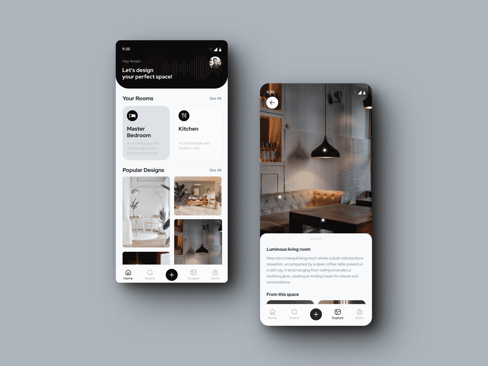
End-to-End application to help you design a place that you can call home
Role
Solo UX Designer
Time
80 Hours (4 weeks)
Tools:
Figma, Figjam
Project Background
From people wishing to have grand mansions to those wishing to have a small cozy yet home full of all amenities, one thing that has remained constant is the love and admiration for aesthetically pleasing interiors. It is perhaps the first thing that everyone notices once we venture into someone’s home. How well a home’s interior is designed defines the owner’s aesthetic taste and often is central to setting a statement. So people take effort to take care of how their home looks and feels.
However, whenever people look to design their home, they get bombarded with tons of options that are available in the world and have difficulty in understanding which ones are going to look good together, if they are going to match with wall or flooring etc. Most of the time, people take these decision based on hunch. Sometimes it works and other times it does not. With our application, we want to help people in making interior design decisions by giving an interactive platform where they can design their own home with range of products.
Solution
Empowering users with an end-to-end mobile app for home design, offering unparalleled control and immense flexibility.
Duplicate your room onto your phone.
Scan your room using your mobile phone and effortlessly capture not only the exact dimensions but also a comprehensive inventory of everything within your room.
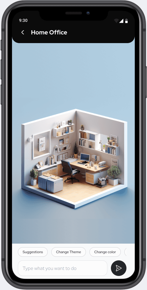

Explore a variety of recommended options
Experience the ease of transforming your room's appearance with just a few clicks, exploring various themes and colors effortlessly.
Test it out before making a furniture purchase.
Uncertain about how certain furniture, curtains, or flooring will fit into your home's aesthetic? No need to worry – you can test them out on your mobile device before committing to a purchase.

And here’s how I got there:
01 Research
Secondary Research
Competitive Analysis
Teardown
User Interviews
02 Define
Persona
Feature Set
HMW Statements
Task Flows
Sitemap
03 Design
Low Fidelity Wireframes
Mid Fidelity Wireframes
Branding and UI Kit
High Fidelity Prototype
04 Testing
Usability Testing
05 Revisions
Iterations
Research
To better understand users’ challenges, I conducted comprehensive research to delve into the user needs, preferences, and behaviours. This involved initiating an secondary research, followed by user interviews.
Secondary Research
I began my research by conducting an in-depth analysis of existing technologies to seek potential solutions for tackling this challenge. Throughout my investigation, I delved into technologies with the capacity to transform the approach to home design, and among these, I identified Augmented Reality (AR) as a promising choice.
Augmented Reality (AR) technology can be used to make this task much more simpler for users. It is an enhanced, interactive version of a real-world environment achieved through digital visual elements, sounds and other sensory stimuli via holographic technology. Furthermore, accessibility to this technology has expanded to a broader user base with the introduction of LiDAR sensors in iPhone models starting from the iPhone 12, making it more readily available to the general public.
How does LiDAR sensor work?
Systems that use LiDAR send out pulses of light just outside the visible spectrum and measure how long it takes for each pulse to return. Whenever the pulse reaches some object, data points are collected regarding its direction and distance from LiDAR.
With repeated pings, a device with LiDAR can also learn how nearby objects move, their speed, and whether they are facing toward or away from the LiDAR device. Here are some examples of real applications in the market:

Canvas.io
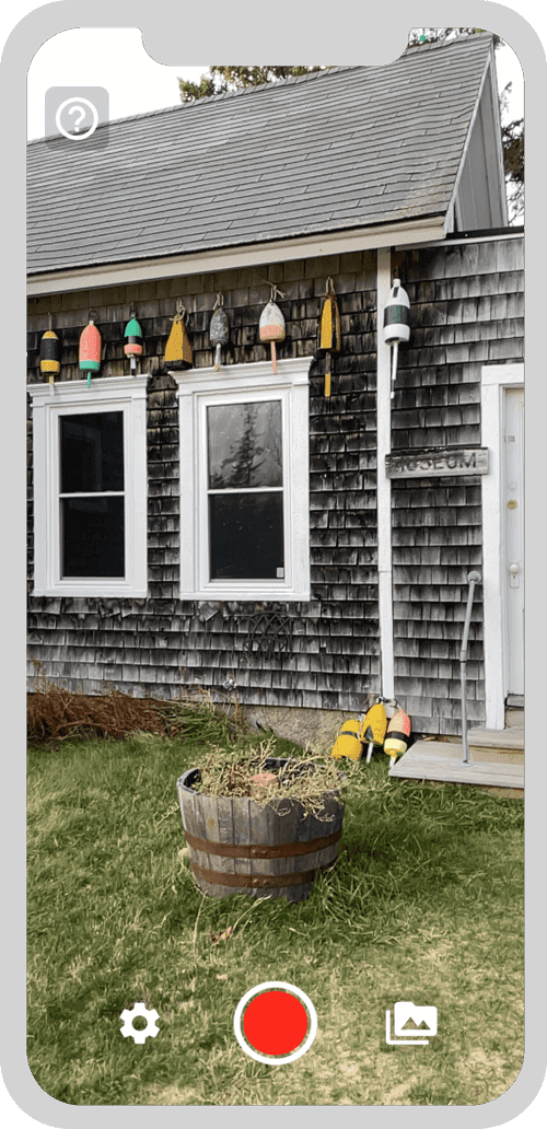
SiteScape
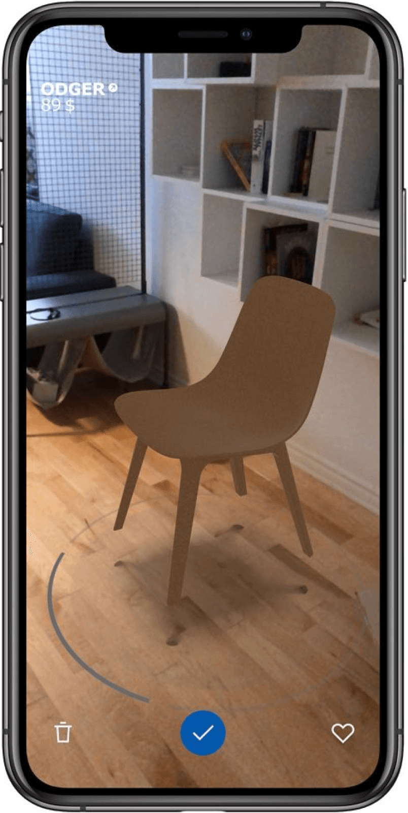
Ikea
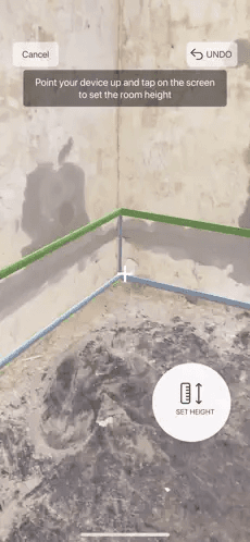
Magicplan
Hence, from the secondary research, I concluded that AR technology is easily accessible to users via mobile and is mature enough to be used in real-world scenarios.
Success of this project mainly depends how easy we make it for home owners to make design decisions to design their home. Giving them the control and flexibility to interact with their home's model as they wish is going to be the key differentiator from other furniture e-commerce platforms.
Competitive Analysis
After concluding the feasibility of the approach, I proceeded with competitive analysis to understand strengths and weaknesses of potential competitors.
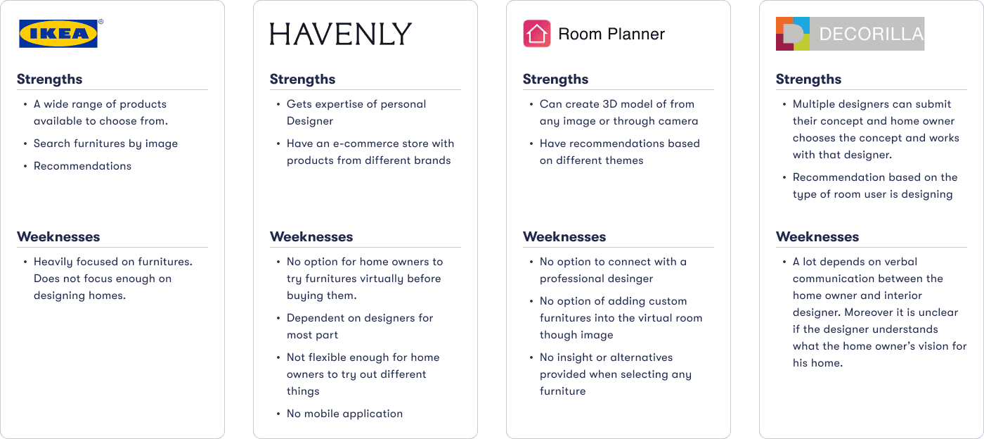
I proceeded to conduct a comprehensive teardown to delve deep into each competitor’s value propositions and the methods employed to establish this value. Additionally, I closely observed the design patterns during this process.
User Interviews
I utilised the user survey for screening participants for subsequent user interviews. These interviews were conducted both in-person and online to gain deeper insights into user behaviour and internet usage patterns.
Participants
4 Users
Ages
21 - 34
Gender
Mixed
The interviews provided the following insights:
Inspiration
All participants found inspiration for their home interiors on platforms like Pinterest, Instagram, and YouTube videos."
Communicating Ideas
While participants primarily used images and videos to explain their ideas, they often found it insufficient to convey the complete vision accurately.
Mismatch in expectations
Participants often depend on interior designers to interpret and visualize their ideas, but there is reasonable chance of mismatch between expectations and the final room design.
Define
Following the research phase, I proceeded to organise the gathered information from last stage into personas, HMW statements and sitemap..
Persona
I developed a user persona that embodies the feedback and opinions shared by users in my interviews. Consistently referencing this persona throughout the design process ensured my solutions aligned with users’ core needs and effectively addressed their issues.
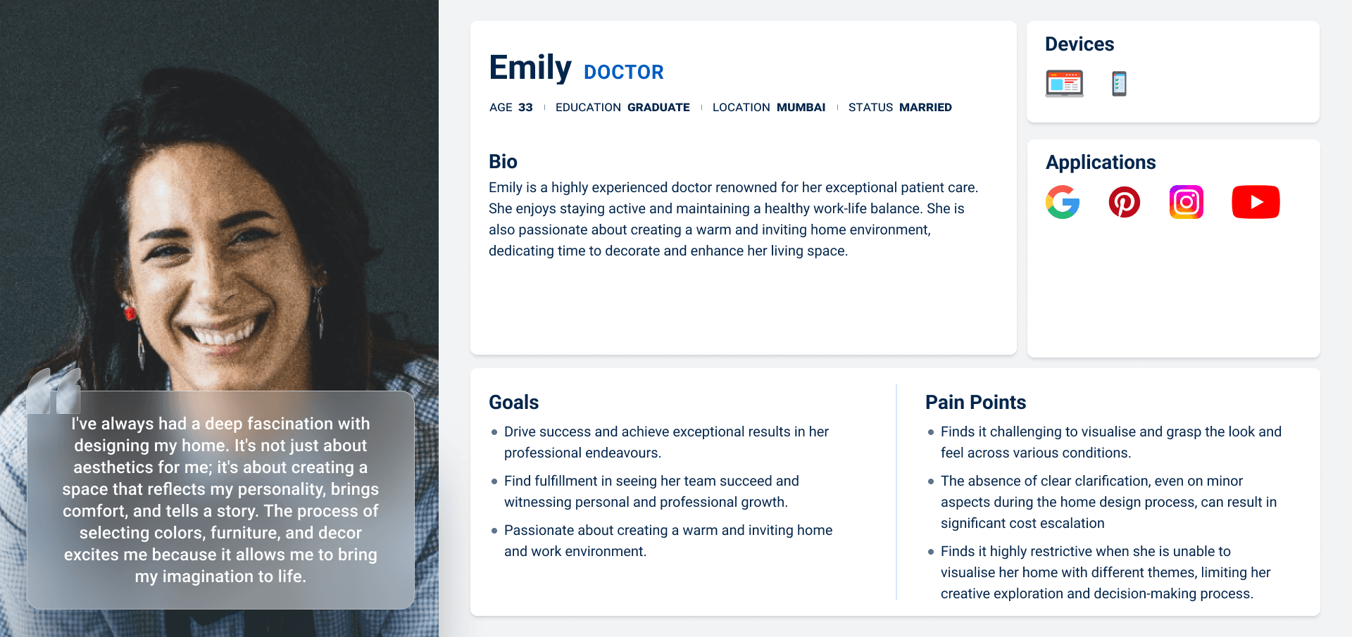
Design Challenges
To reinforce the project's direction, I translated research insights into "How Might We" statements, which centered on both user needs and goals. This approach helped me to distill the common themes of the challenge and empathize with the users, resulting in human-centered solutions generated through brainstorming.
“How might we help homeowners to explore and visualise various design ideas for their homes in a virtual world, before implementing them in reality ?”
“How might we help users to effectively communicate their design ideas for their homes clearly when sharing their vision with others ?”
“How might we assist users by providing personalised color and furniture recommendations based on the design choices they have already made?”
Feature Set
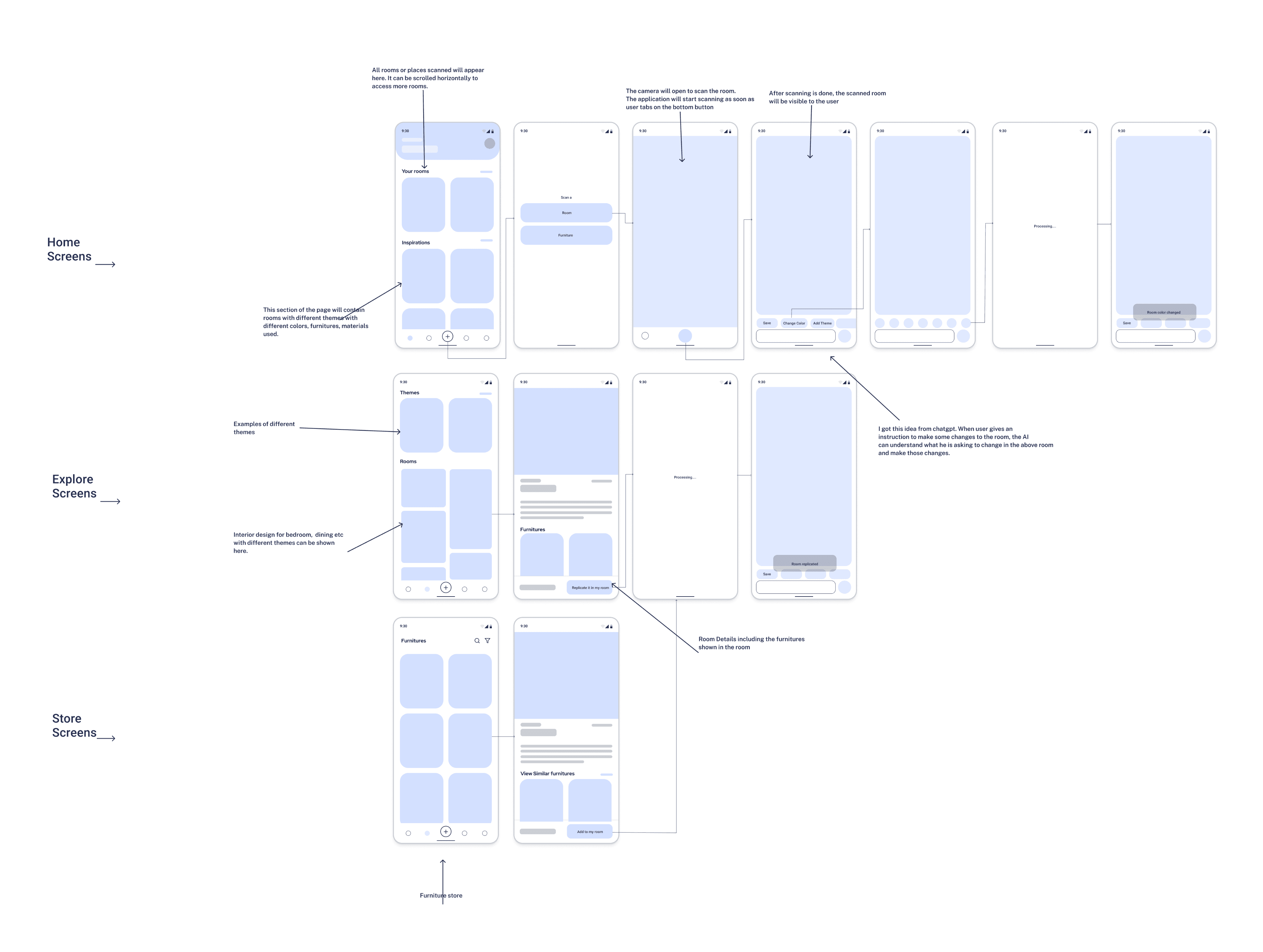
I decided to focus on Homely’s key features and basic interactions for this iteration of the design. In this iterations, I was primarily focused on getting the basic feature right and get them tested.
Must have
Features
Description
Home Screen
Home screen where user can see his/her rooms sorted by latest activity
Scan room
Measure dimension of any room and create 3D view
Explore
Explore designs with different themes for any room
Add item to room
Add furniture or other items in the virtual room
Remove item from room
Remove furniture or other items in the virtual room
Replace item in room
Replace furniture or other item in the virtual room
Add / Change theme
Add or change theme for the virtual room
AI Assistant
An AI assistant which can make changes with simple instructions
Task Flows
After creating persona and defining design challenges, I proceeded with creating task flows as following:

Scan new room

Add Item to Room

Remove item from room

Replace item in room

Design
After completing the research phase and defining key elements, I initiated the development of solutions.
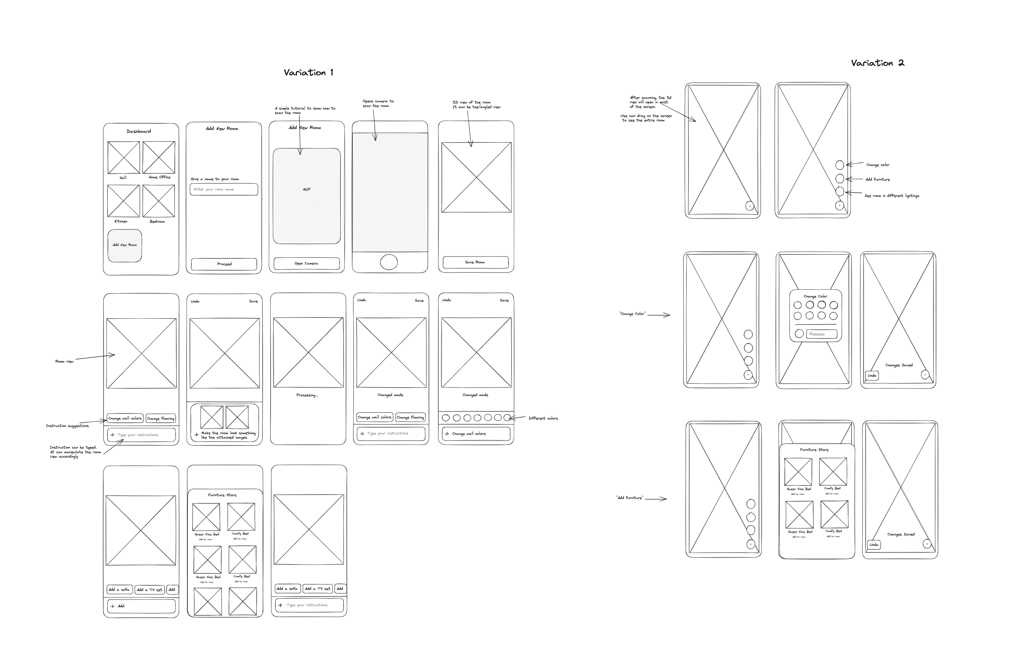
Low Fidelity Wireframes
Once I had visualised my user flow and defined the key pages, I began exploring potential layouts and explored different directions for the design.
Mid Fidelity Wireframes
Branding and UI Kit
When developing the brand for this app, I opted for a Black & White color scheme. This choice was made to evoke elegance and simplicity, resulting in a clean and modern aesthetic. The primary color is black, complemented by white as the secondary color.
Logo
Homely
Colors
Color palette
Primary
#252525
Secondary
#FCFBFC
Success
#35C78A
Warning
#FFA126
Danger
#EC5426
Buttons
Primary
Default
Clicked
Secondary
Default
Clicked
Typograhy
Red Hat
Display
Text Color
#6C757D
Paragraph example
Lorem ipsum dolor sit amet consectetur. Felis vel in molestie quam semper integer sit. Dui quam platea adipiscing quisque ut consectetur hendrerit ut. Sit tellus egestas amet amet metus hendrerit eget.
Primary
Name
Font
Size
Line Height
Heading 1
Red Hat
Display
32px
40px
Heading 2
Red Hat
Display
28px
36px
Heading 3
Red Hat
Display
24px
28px
Heading 4
Red Hat
Display
20px
24px
Paragraph
Red Hat
Display
16px
20px
Input
Room Name
Where are you going?
Room Name
Home Office
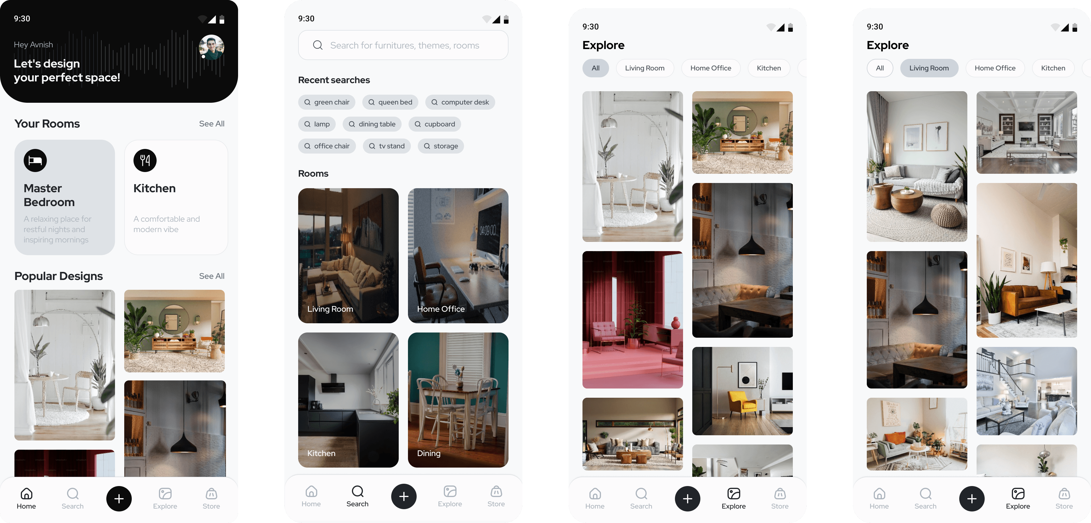
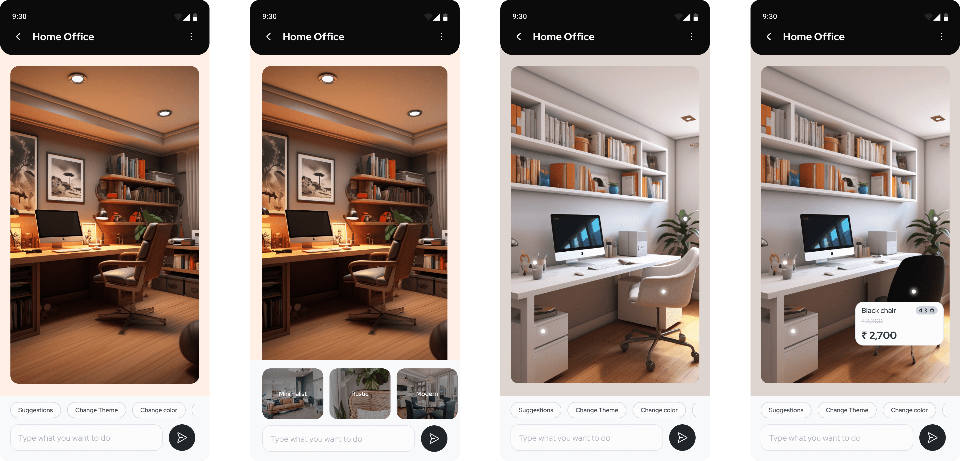
High Fidelity Mocks
After establishing my UI design, I polished my mid-fedilities and applied the established styles to the screens. Bringing it all together to create something inclusive and human-centric.
Testing
After creation of high level mock and prototype, I conducted usability testing to test the website and gather insight about user’s behaviour.
Usability Testing
I conducted a usability test involving four participants, spread out over five days, with in-person moderation. During these sessions, users were assigned a series of tasks to complete and provide feedback on.
Test Objectives:
Test if participants were able to navigate through the mobile app.
Check if participants were able to complete the tasks as intended.
Observe if there are mis-clicks while participants were completing the tasks.
Test Results:
All participants were successfully able to navigate through the mobile app design.
100% of participants were able to complete the task successfully. But there were mis-clicks while completing “Remove furniture”, “Replace furniture” tasks.
Various other pain points were also discovered during these tests (more on this below)
Iterations
Priority revisions were made based on my usability test feedback. The changes implemented are as follows:
Previous
New
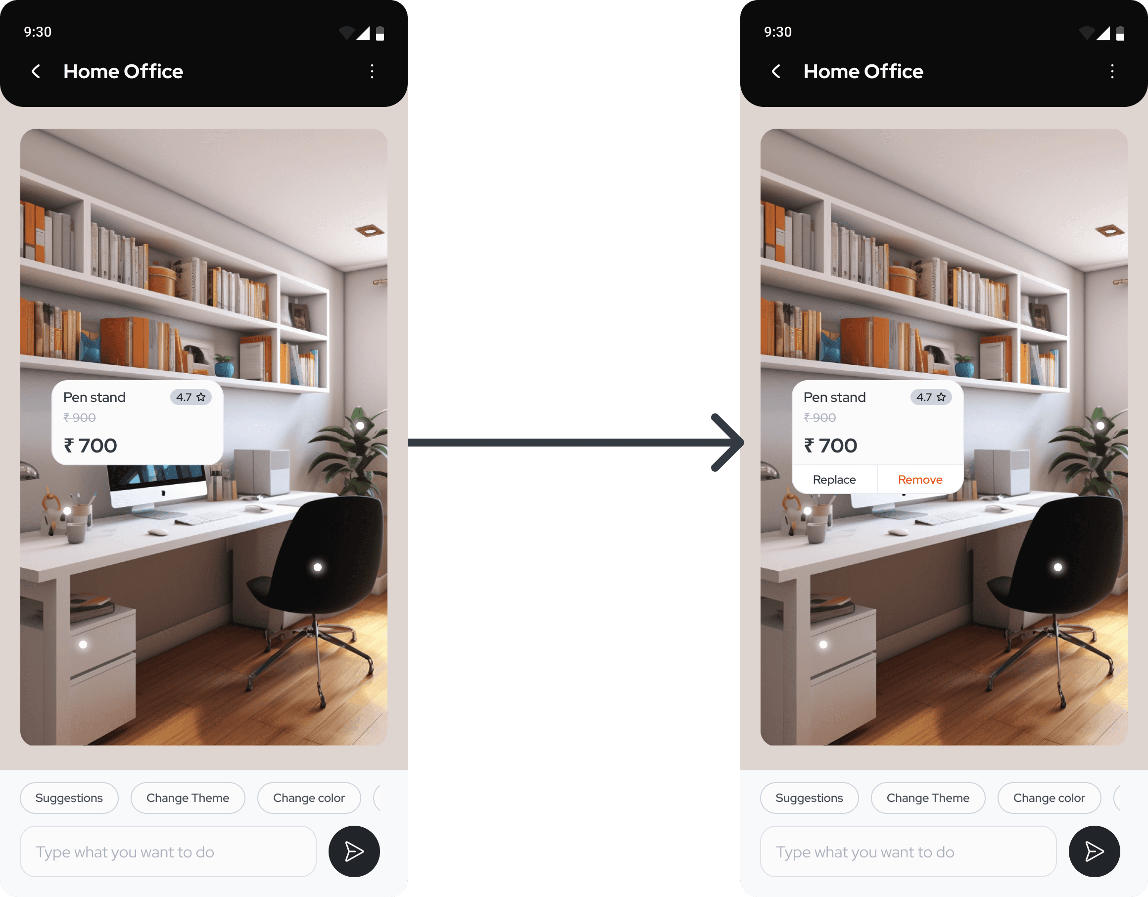
Handling misclicks
Whenever task is to remove an item from the virtual room, they first tend to click on the item itself on the screen. Participants are expecting to see “Replace” and “Remove” in the same popup alongside item details. Added option to remove and replace from
The title “Instruction” lacks clarity
Several participants raised concerns about the lack of clarity on this page. They were interpreting 'Instructions' as Dos and Don'ts. So I have updated the text to address this issue.
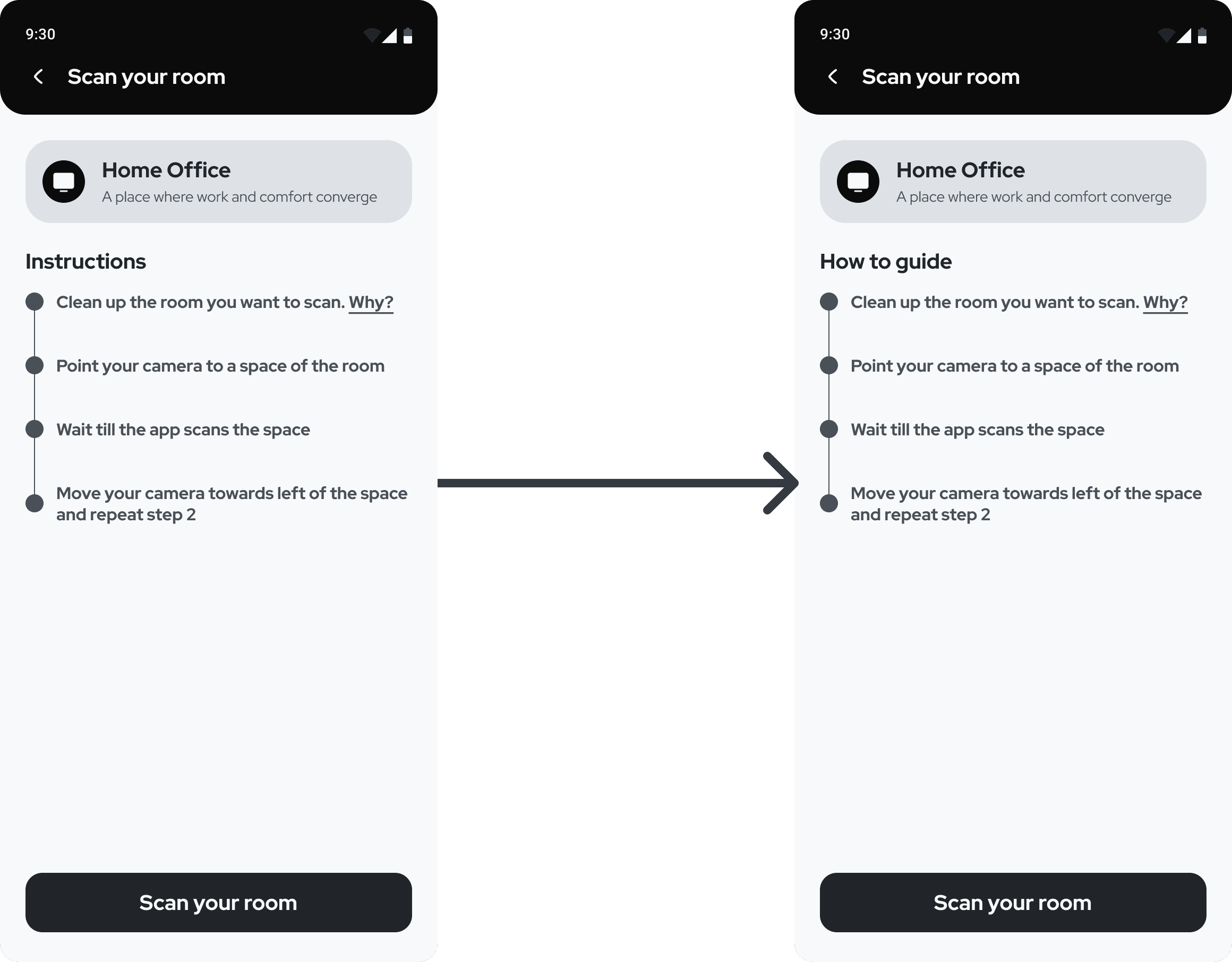
Previous
New
Conclusion
Reflection
I enjoyed a lot while working on this project. It gave me the opportunity to delve into new technologies and tools. My journey began with exploring AR and researching iPhone's features for secondary research. Additionally, utilizing Midjourney and Adobe Photoshop for image generation proved to be highly insightful.
This project has been a valuable learning experience, highlighting the significance of trusting the process and seeking regular feedback from users.
Future Goals
Get this product into the hands of more users for further validation and continue refining the app.
I am confident that there is room for enhancing the UI design and interaction design to elevate the user experience to the next level. I am committed to working diligently towards achieving this goal.