Google Chrome
Improve chrome's tab management, bookmarks & history
Project Background
Browsers are one of most useful inventions and heavily utilised pieces of software out there, connecting us to countless applications and websites, eliminating the need for downloading dedicated software. Google Chrome, with around 2.65 billion global users with 63.58% market share, is a widely used browser.
While the ways people utilise and the reasons behind their internet usage have evolved over the years, Chrome, unfortunately, has not quite kept up with these changing needs. This lack of evolution has resulted in users facing challenges when trying to navigate Chrome efficiently.
My aim with this project is to enhance the internet browsing experience within Chrome.
Key Features
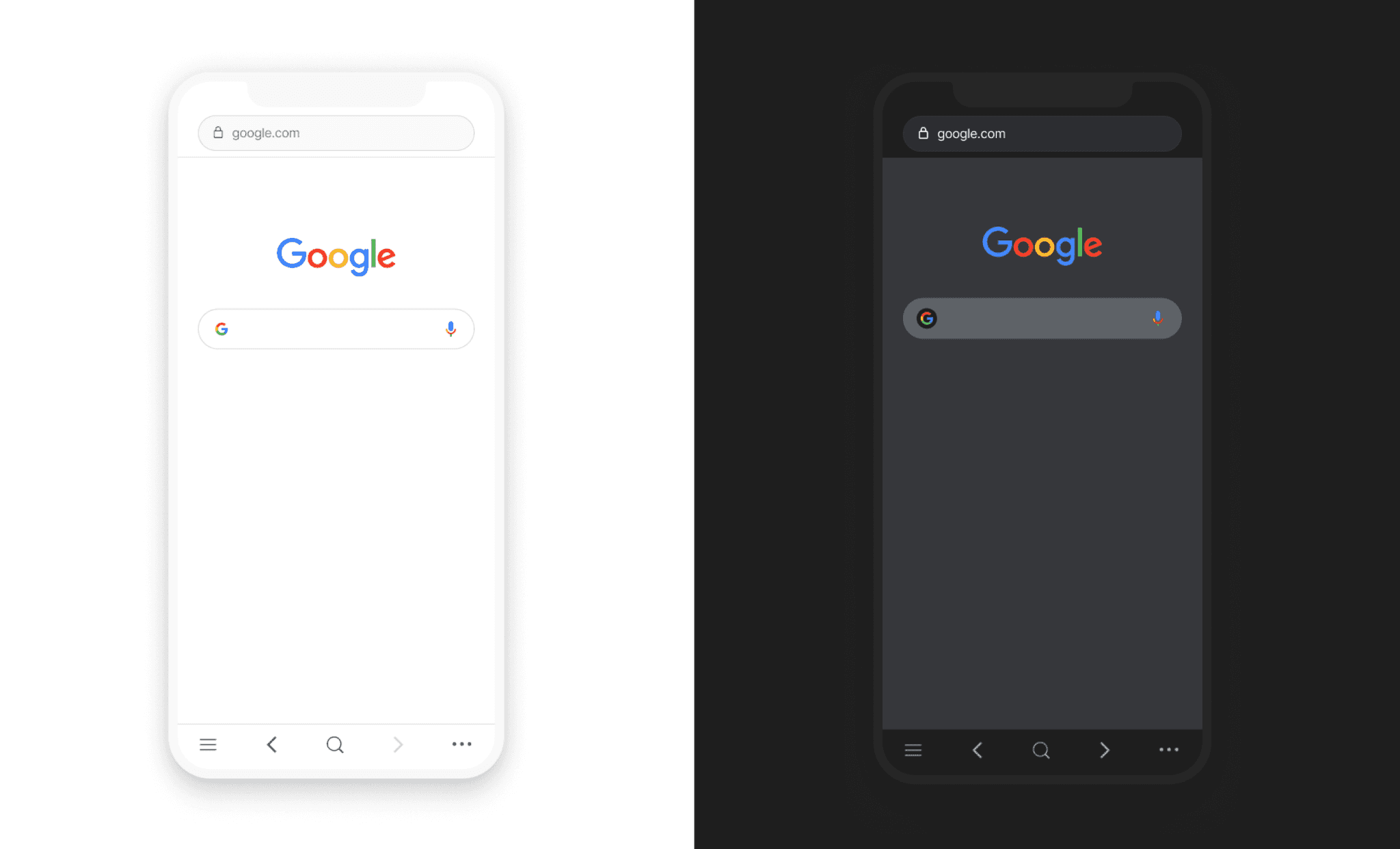
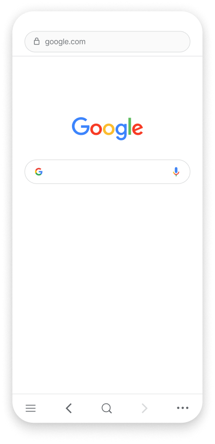
Making chrome's actions more accessible
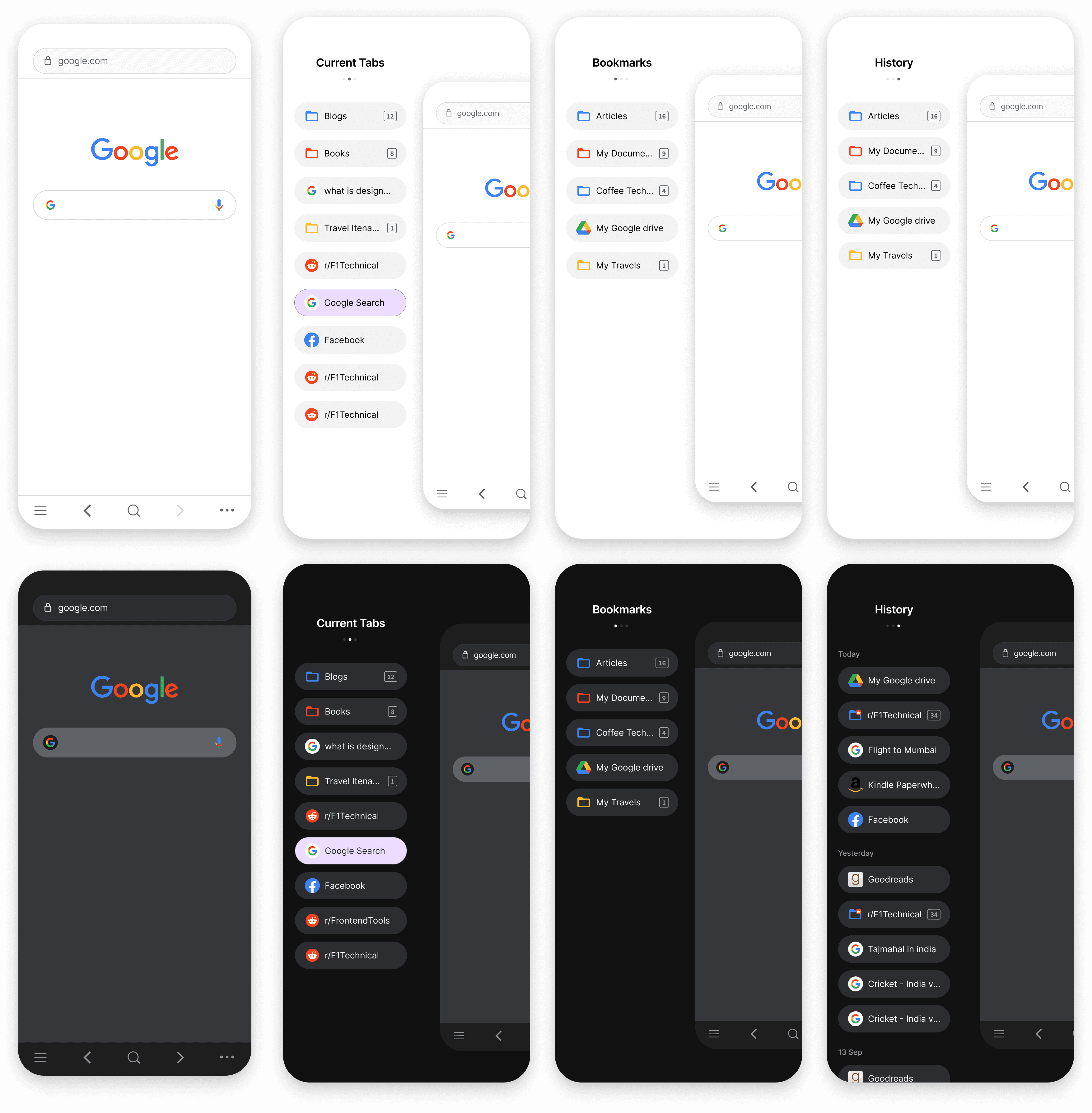
The most frequently used actions such as forward, back, search, and tabs are now conveniently accessible from the bottom for enhanced user convenience.
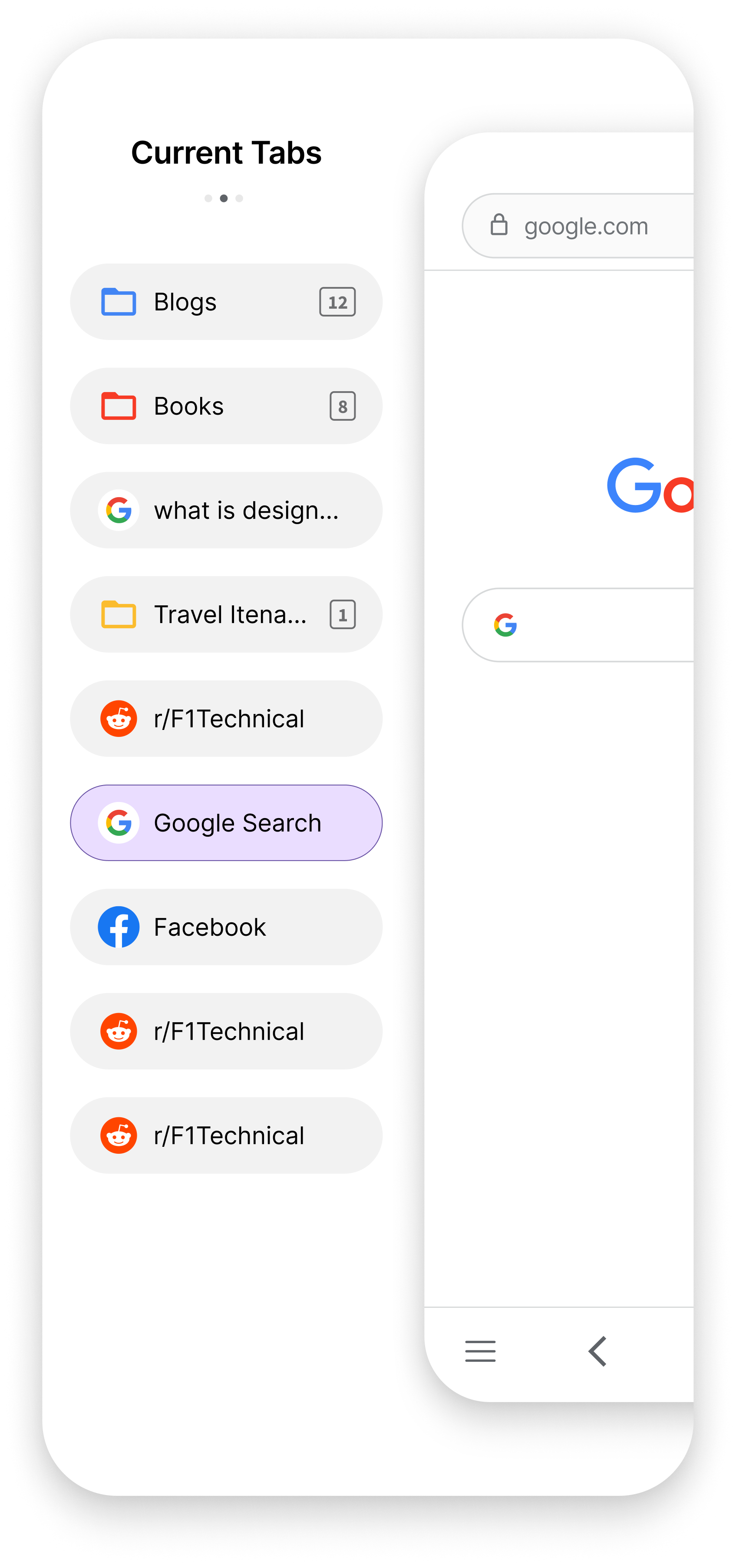
Introducing a new location for chrome tabs
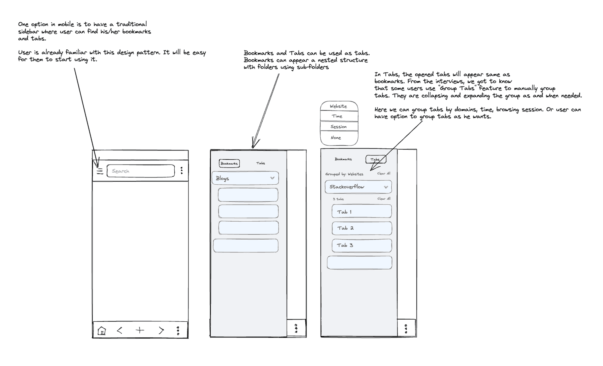
As current tabs, bookmarks, and history all involve links to webpages on the internet, they have been consolidated into a single sidebar for easy access and organization.
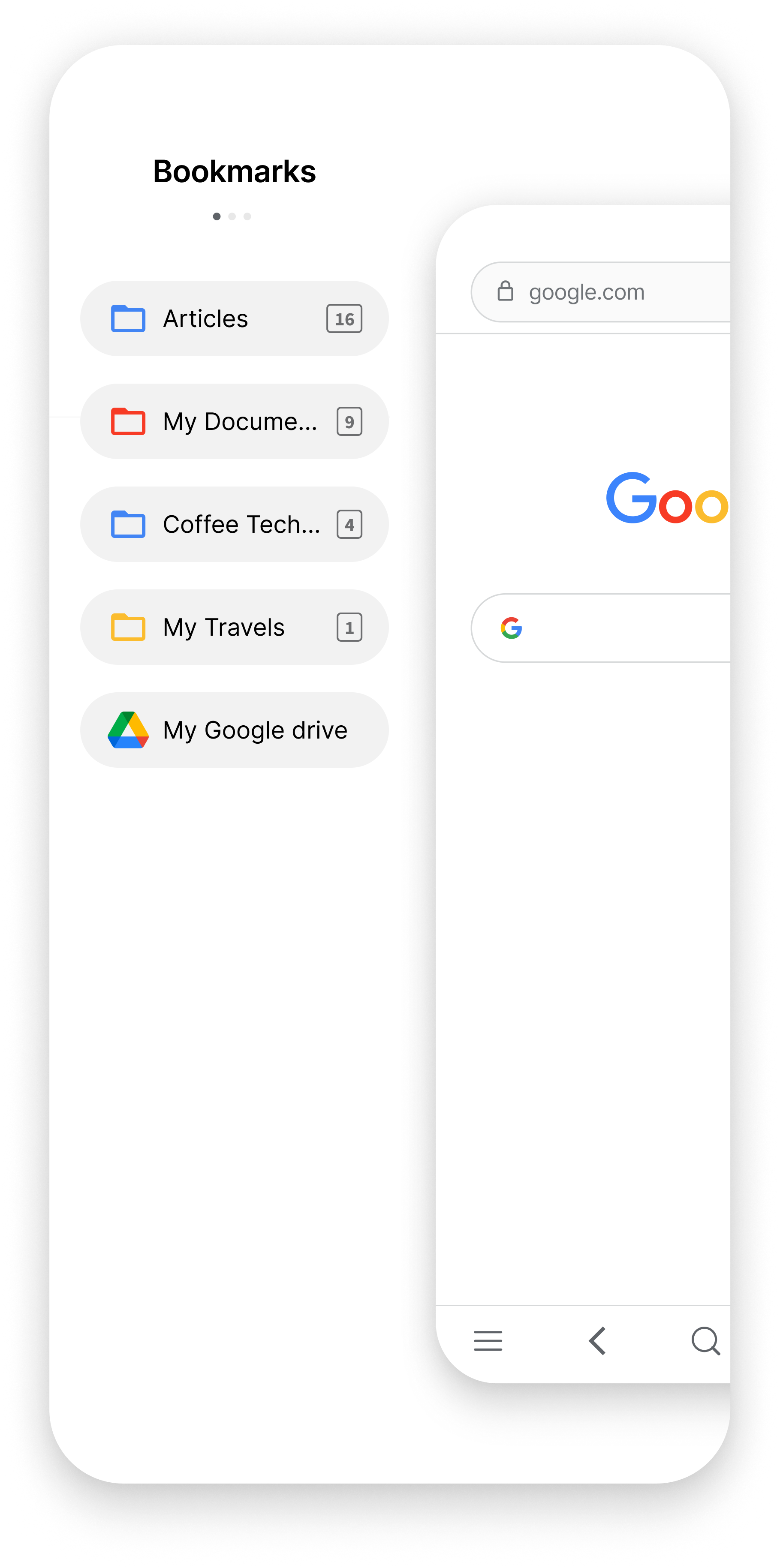
Introducing Tab Folders
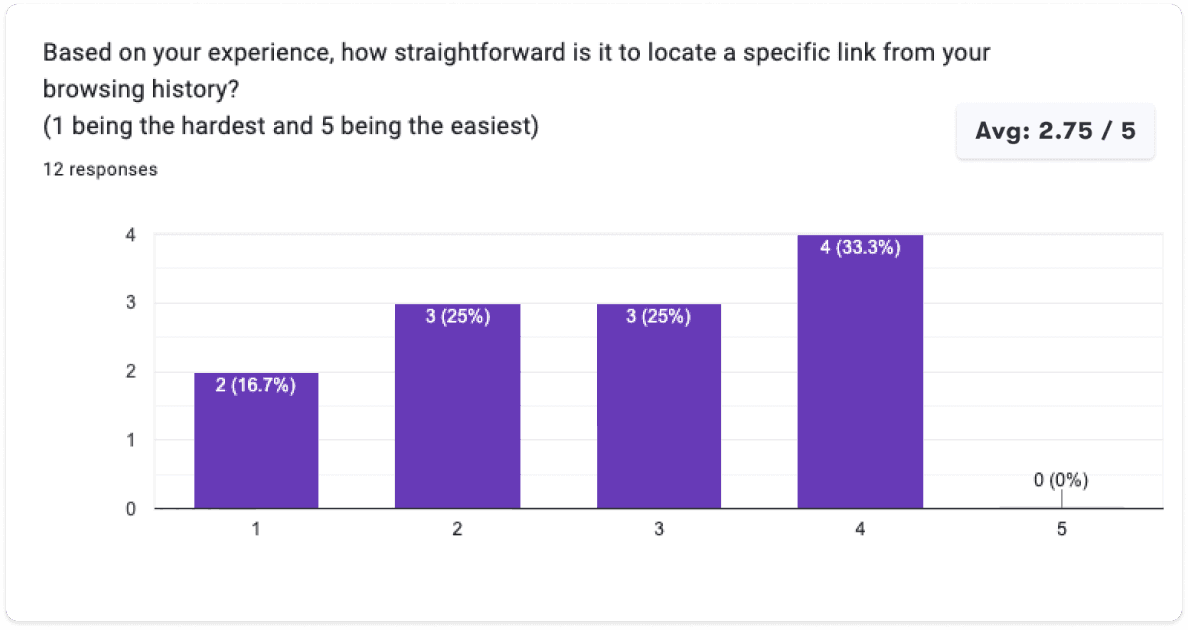
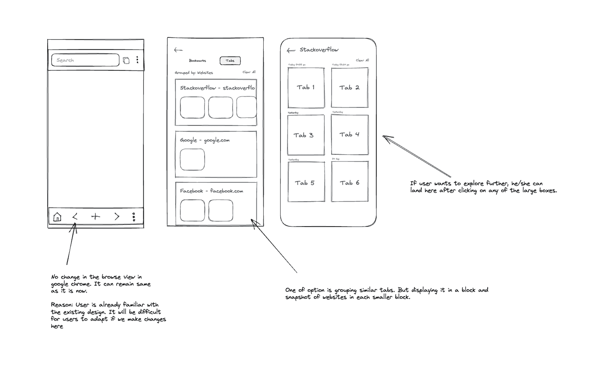
Frequently, the current tabs and history sections become cluttered with numerous similar links, making it challenging to locate a specific link within the sea of tabs. Tab folders have been introduced to group similar links, thereby enhancing the user experience with a clutter-free approach.
Secondary Research
During this research, I explored many open data sources that could provide insights on browsing experience, pros and cons of different browsers as well as analysed discussions and forums like Twitter and Reddit to get unfiltered experiences from users.
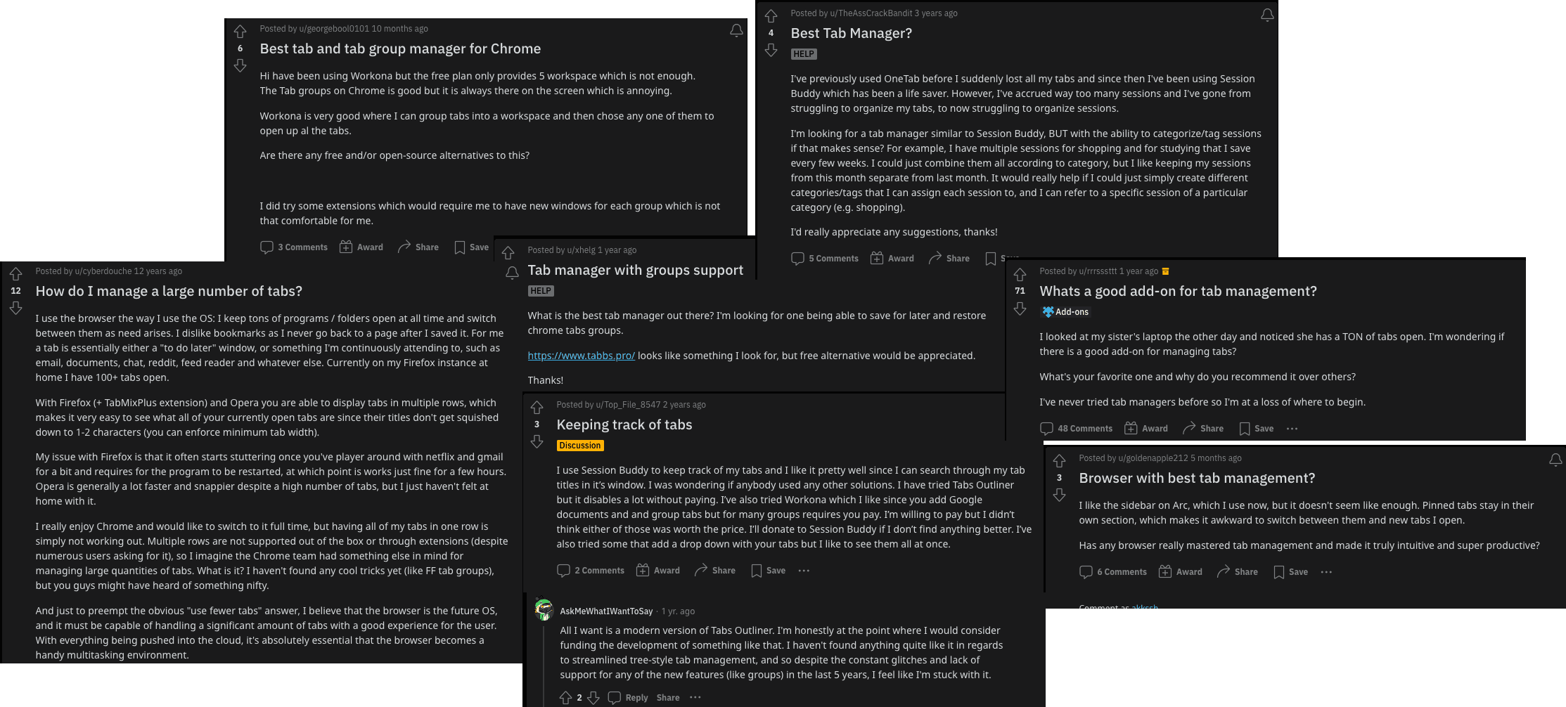
Reddit posts from users asking for better tab management

Tweets from users about their browsing experience
Key Issues Identified
Competitive Analysis
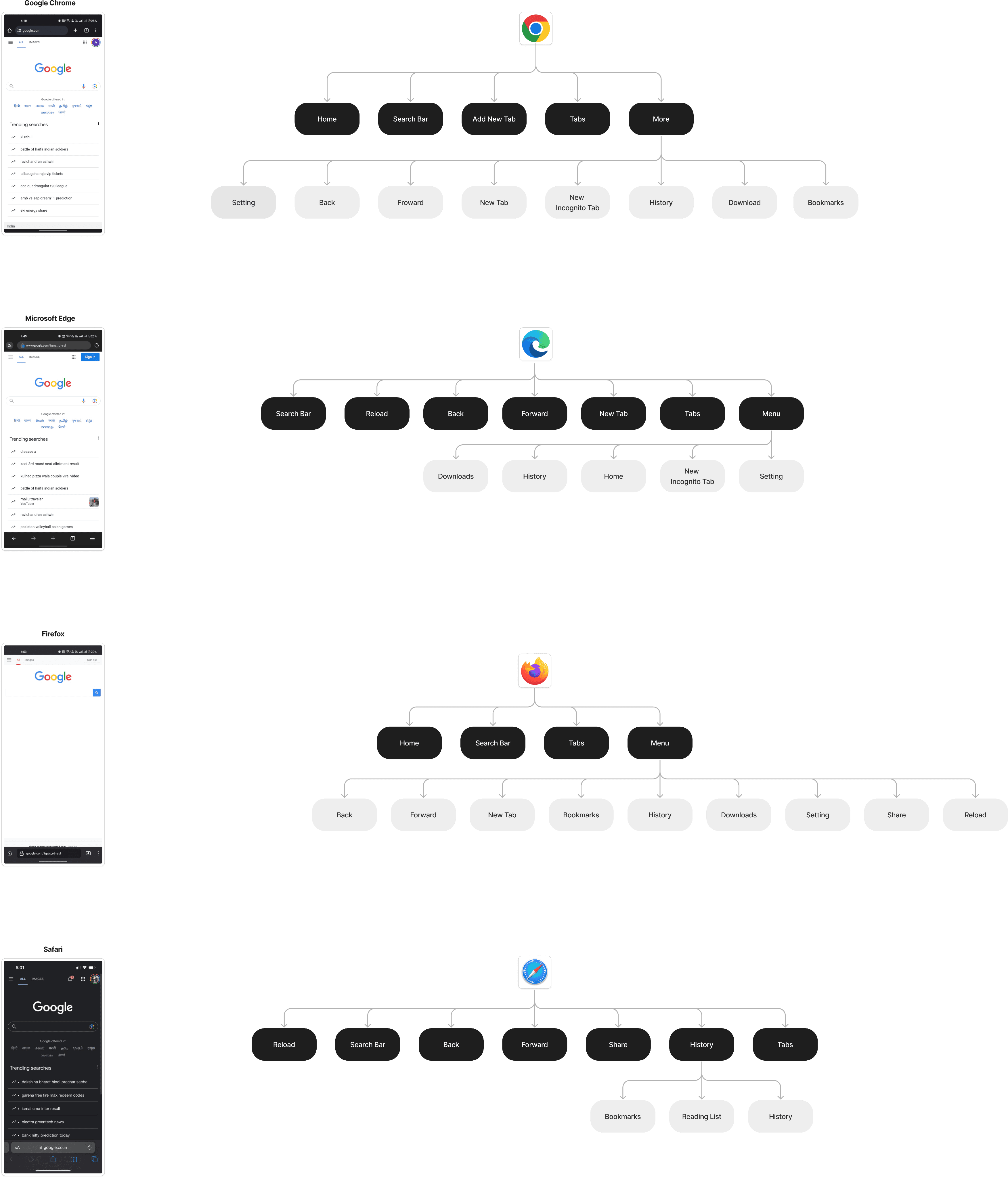
I conducted a competitive analysis of other popular browsers to gain a thorough understanding of their behaviours and the reasons behind their distinctions.
User Survey
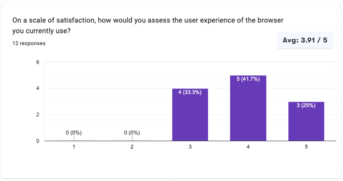
I conducted an initial survey involving 12 participants, to establish a preliminary grasp of user challenges and behaviours.
Key Insights
- 66.7% of users opt for Google Chrome as their preferred web browser.
- Performance, UX, Primary are the top priorities for users.
- All users frequently find themselves opening a substantial number of tabs.
User Interviews
I utilised the user survey for screening participants for subsequent user interviews to gain deeper insights into user behaviour and internet usage patterns.
Tab Overload
Participants unanimously agreed that once the quantity of open tabs exceeds a certain point, it tends to lead to confusion and disorder.
Bookmarks, helpful yet cumbersome.
Participants expressed a desire for a more user-friendly bookmarking system that streamlines the process of both saving and retrieving links.
Simplicity
Some participants value the simplicity of Chrome and Safari, citing their easy learning curve and efficiency in accomplishing tasks.
Desktop for Depth, Mobile for Speed.
Participants use desktop browsers for complex tasks and turn to mobile browsers for simpler ones.
Persona
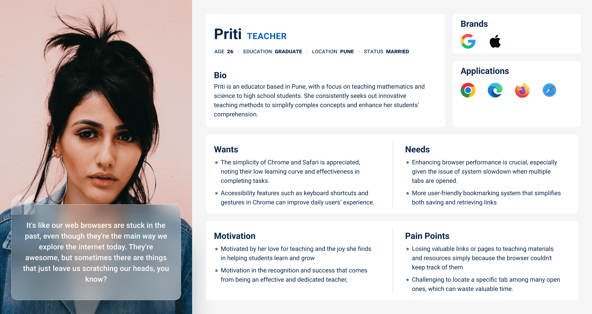
I developed a user persona that embodies the feedback and opinions shared by actual Google Chrome users in my interviews and survey responses.
Design Challenges
I translated research insights into "How Might We" statements to generate human-centered solutions through brainstorming.
How might we simplify browser's tab management for users with a high number of open tabs?
How might we improve the user experience for saving and retrieving browser bookmarks?
How might we create a simple and user-friendly experience for locating links in browsing history?
Sitemap
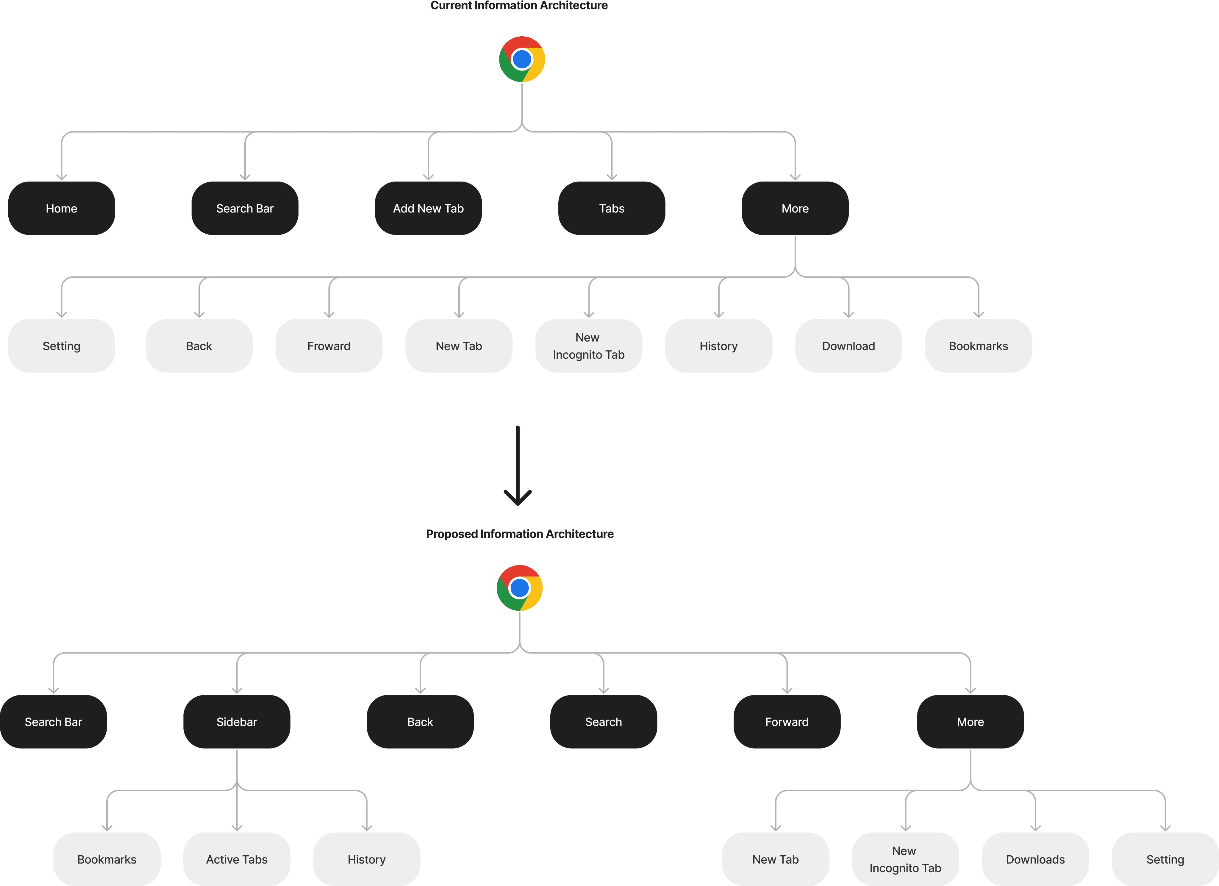
Based on the competitive analysis, I divided the actions into distinct sections to eliminate clutter and ensure each action is easily accessible.
Sketching Solutions
Once I had finalised the information architecture, I began sketching potential layouts and explored different directions for the design.
Version 1
Version 2
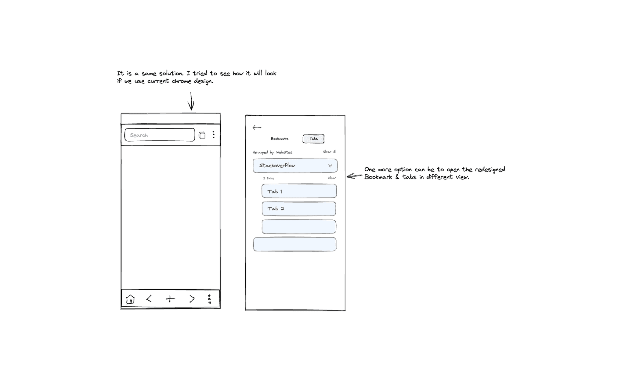
Version 3
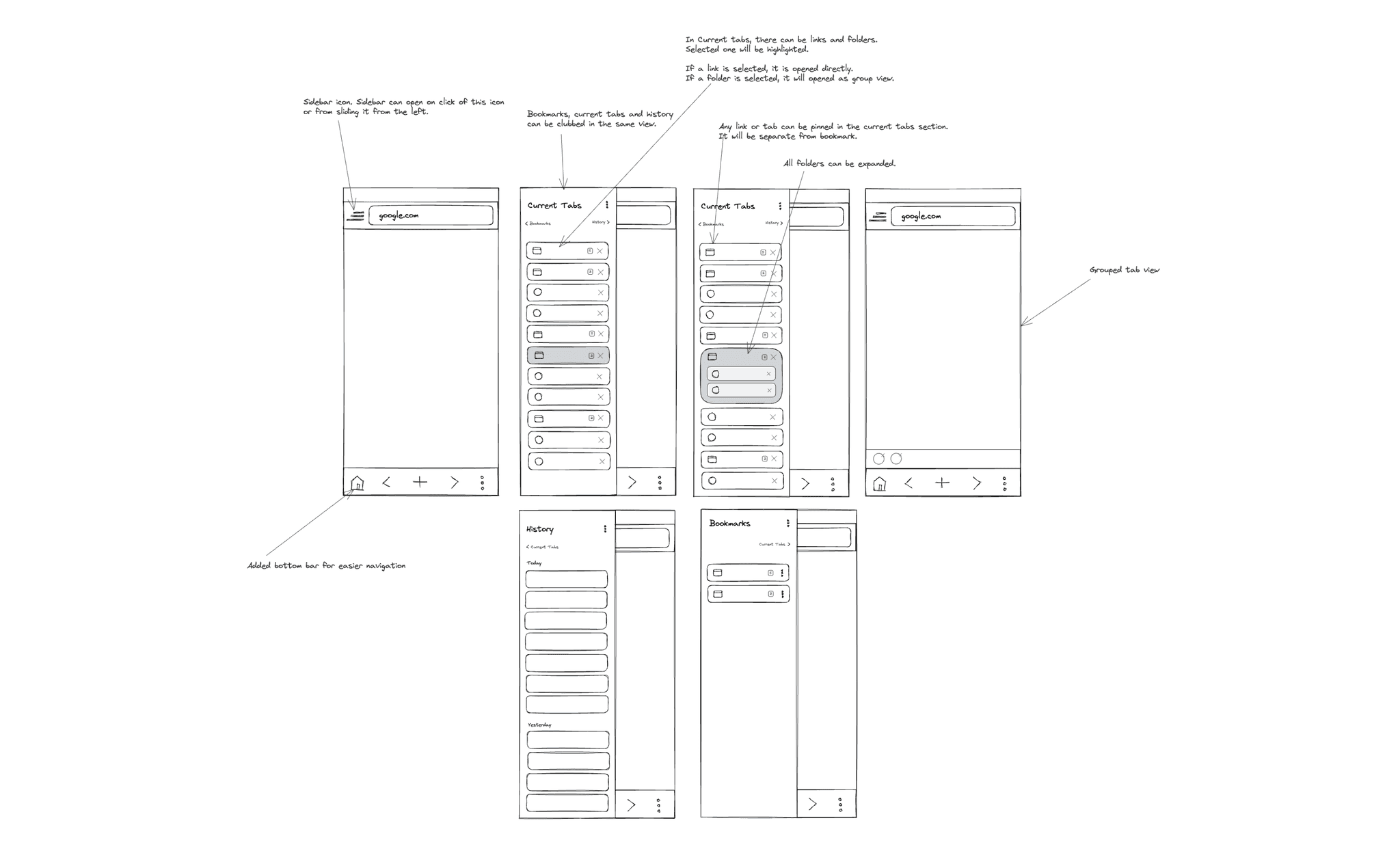
Version 4
Low Fidelity Mocks
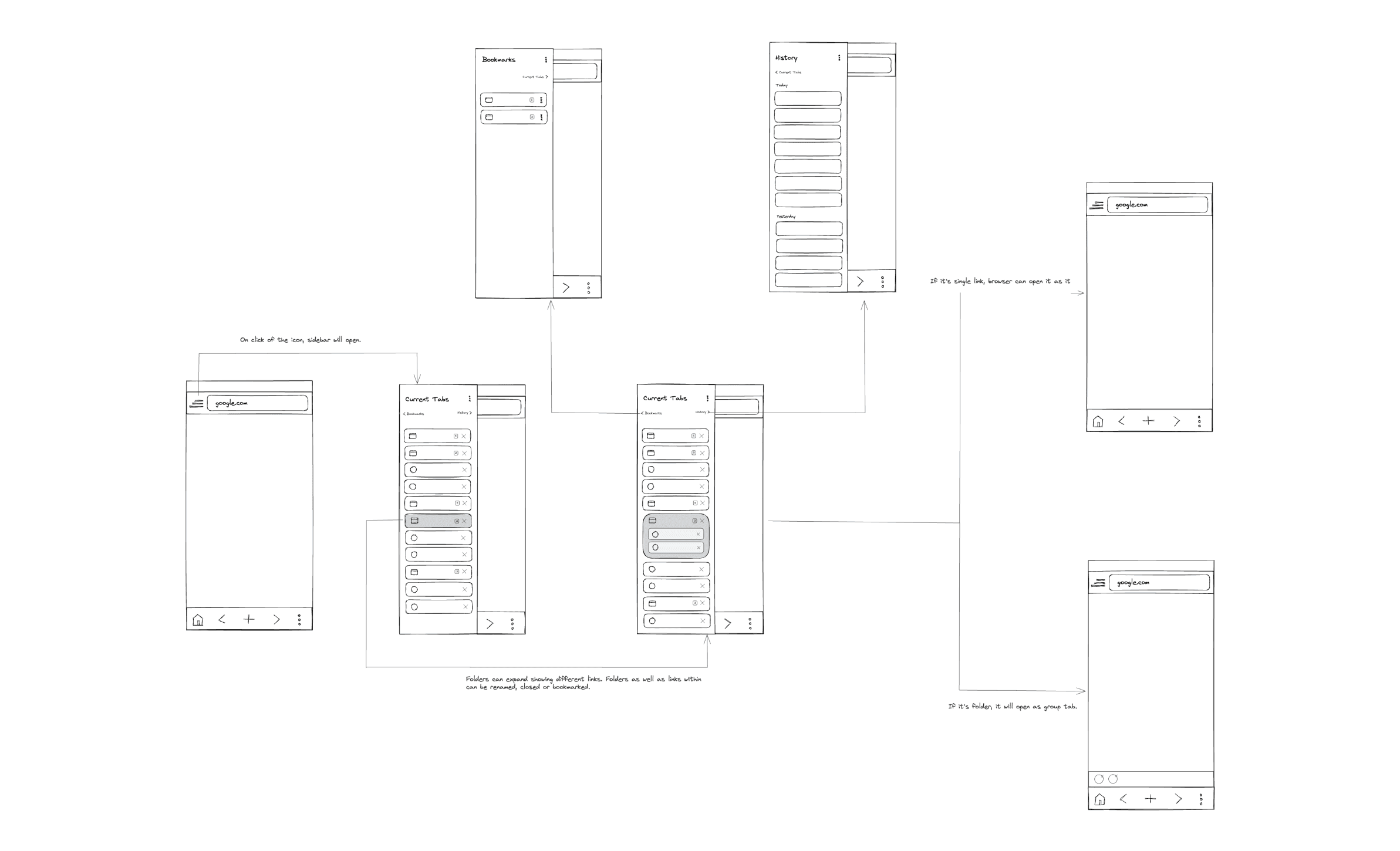
After sketching out several potential solutions, I moved on to develop low-fidelity mockups to swiftly explore various alternatives.
High Fidelity Mocks
I developed high-fidelity mocks for both light and dark modes, ensuring users would find them familiar.
Usability Testing
I conducted a usability test with 5 participants who fit my target audience over 3 days, moderated in-person.
Test Objectives
- Test overall flow and navigation of the proposed design
- Check if users can navigate to bookmarks and history
- Check if users can use the bottom bar effectively
Test Results
- All participants navigated using top and bottom bar
- 60 % navigated to bookmarks/history without difficulty
- Various pain points discovered during tests
Design Iterations
Priority revisions were made based on usability test feedback:
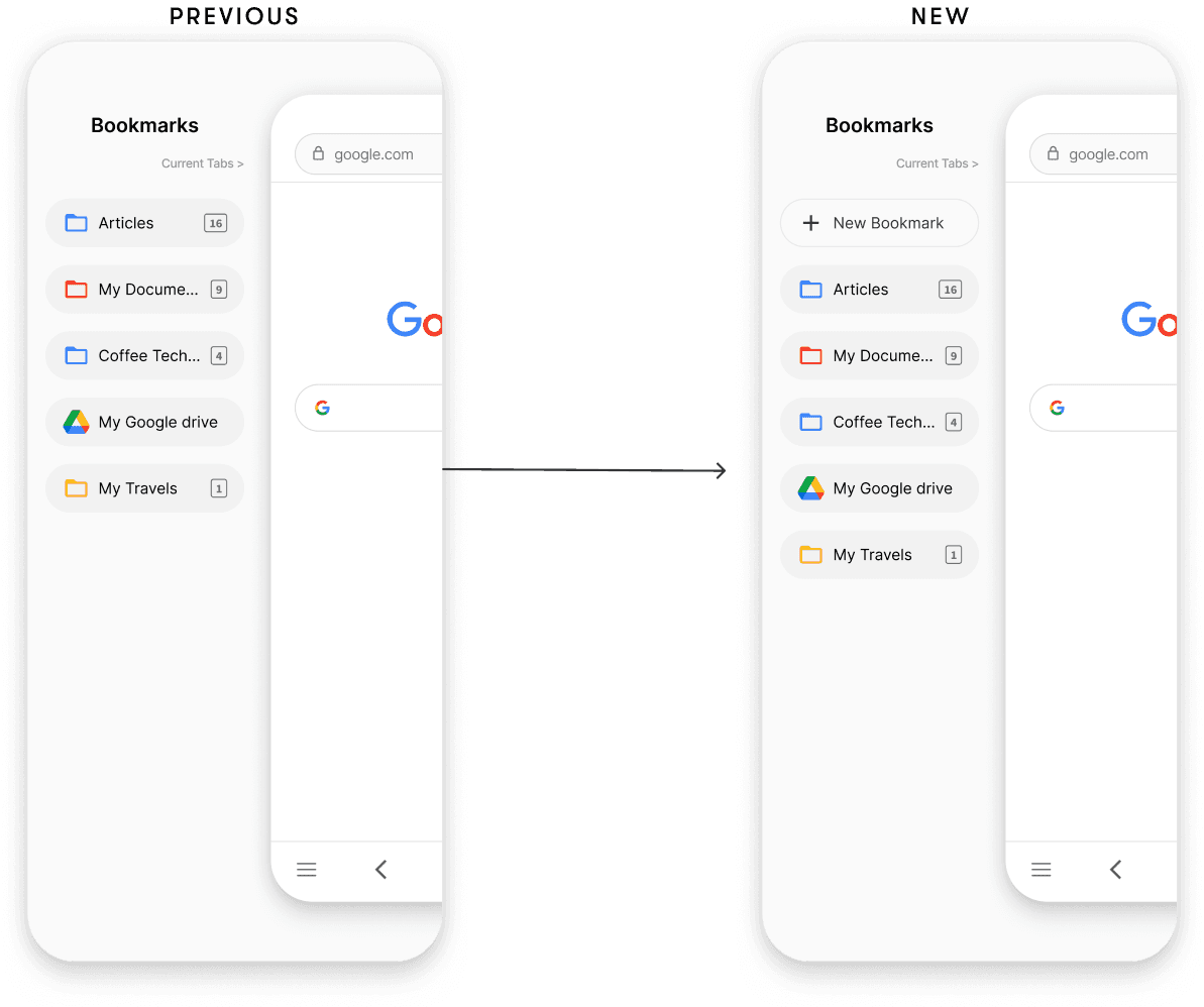
Introducing the 'Add New Bookmark' Action
Some participants raised concerns about the inability to add bookmarks directly within the bookmark list. They suggested it would be more convenient to have this option directly in this screen.
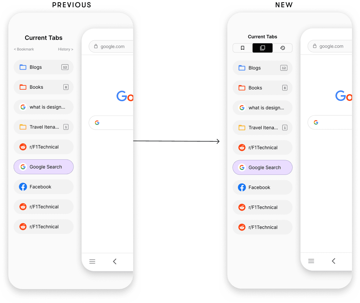
Bookmark and History buttons were not accessible
Both buttons lacked prominence, making them less noticeable. Additionally, their small size led to instances of mis-clicks among participants.
Reflection
This project was quite interesting. Enhancing a well-known browser like Google Chrome presented unique challenges. It was an exciting opportunity to craft a creative solution that could enhance the user experience for a broad audience, all while staying within the familiar patterns of Google Chrome's interface.
Future Goals
- Get this product into more users' hands for further validation
- Shift focus towards enhancing the desktop Chrome experience