Instazen
Redesigning website for a SAAS based product
Project Background
Instazen is a B2B SaaS solution tailored specifically for IT services companies, designed to empower them to realise their full profit potential. It provides valuable insights into the overall performance of any organization and identifies areas where potential revenue loss may occur, allowing for timely adjustments to maximize revenue.
The website was originally launched in 2021 with the primary objective of communicating the product's unique value proposition. However, it has fallen short of expectations. Not only is the website outdated, but it also suffers from repetitive and redundant content.
The purpose of this project is to enhance the existing website by giving it a modern and visually appealing design that effectively promotes the product.
Key Features
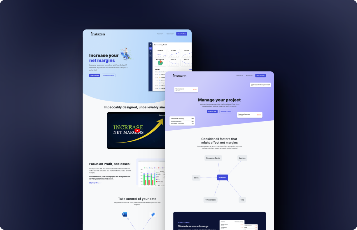
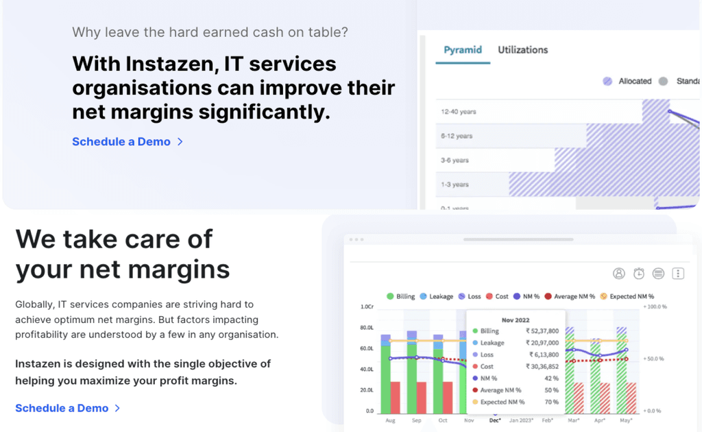
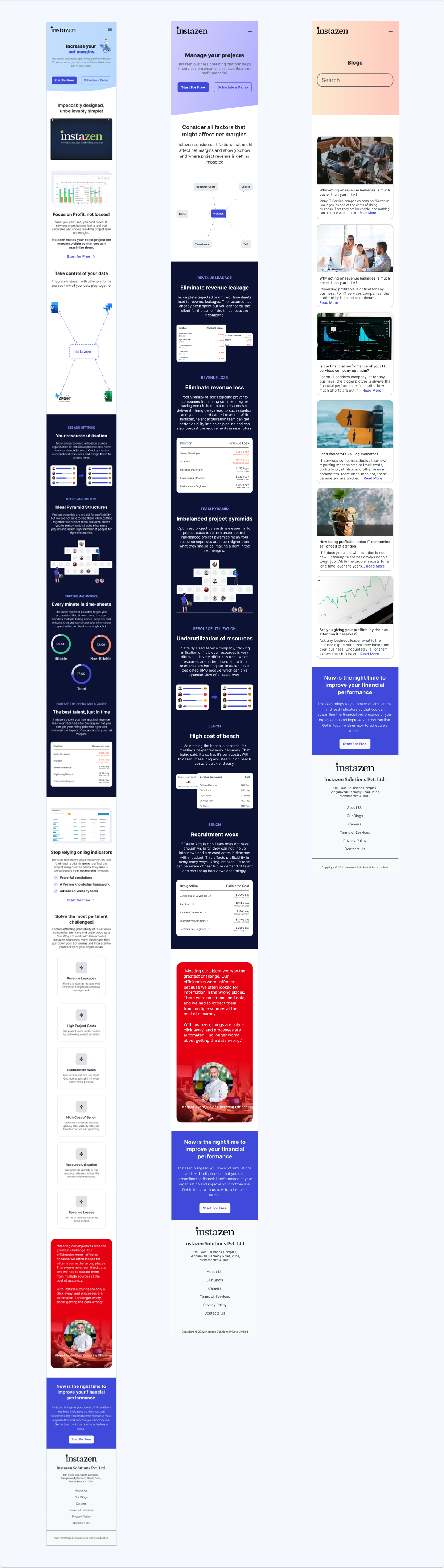
A responsive SAAS website design that aligns with organisation's business objectives without compromising on user experience. I revamped the website to effectively communicate the product's value to its customers, while also enabling them to easily schedule a demo and experience the product firsthand.
Communicate the product's value
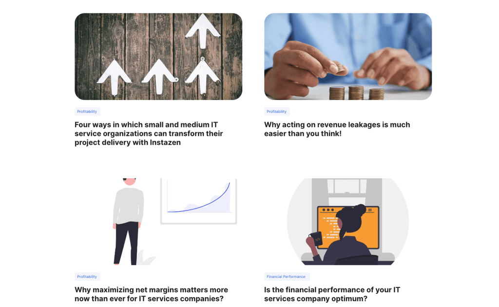
Each feature is accompanied by a relevant image, tag, title, and concise description, simplifying user comprehension through quick scanning.
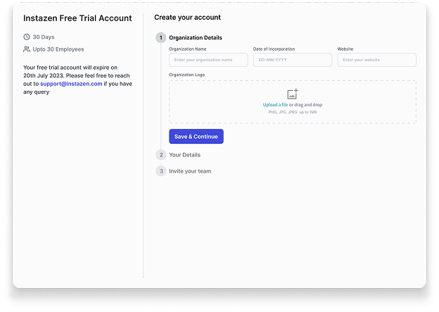
Introducing free trial
Implemented the 'Free Trial' feature to boost lead generation and provide users the opportunity to experience the product firsthand before making any payment commitments.
Secondary Research
To better understand the users and business context, I conducted comprehensive research including secondary research, stakeholder interviews, and user interviews.
I initiated my research process with secondary research to acquire a solid understanding of the domain within which the product operates and the problem it tries to solve. I conducted comprehensive research on the workings of IT service projects, revenue generation, and profit strategies employed by companies.
Furthermore, I conducted a competitive analysis to gain insights into our competitors as well as some popular product websites and examined how they have presented their features on their respective websites.
Visual Clarity
Images and animations thoughtfully enhance the clarity of feature explanations.
Authentic Imagery
Authentic product images provide clear depiction of what users can expect.
Structured Content
Each feature has an image, title, description, and "Learn More" button.
Strategic CTAs
Call-to-Action buttons are strategically positioned for high visibility.
Brand Consistency
All elements strictly align with the website's branding guidelines.
Clear Navigation
Essential pages in top nav, additional links in footer for concise UX.
Stakeholder Interview
I collaborated closely with the Instazen team, engaging in discussions with both the CTO and CEO. These conversations provided me with valuable insights into the company's goals and the product's value offering. They also openly discussed the challenges they face with the existing website and their expectations for the new website.
Based on the interviews, I've identified three key business objectives for this project:
Convey Value Offering
Effectively communicate how Instazen helps IT services companies identify and mitigate revenue leakages.
Increase Leads
Enhance conversion ratio of website visitors who schedule a product demo or opt for a free trial.
Modern & Engaging Design
Design a modern website that appeals to users and captivates their attention.
Heuristic Evaluation
After my secondary research, I proceeded with heuristic evaluation to understand the usability issue in the current website. I rated the issues between 0-4 based on impact to usability (0=not a usability issue, 4=severe usability issue).
Note: Usability impact indicates the extent to which a user may encounter obstacles when attempting to complete their task.
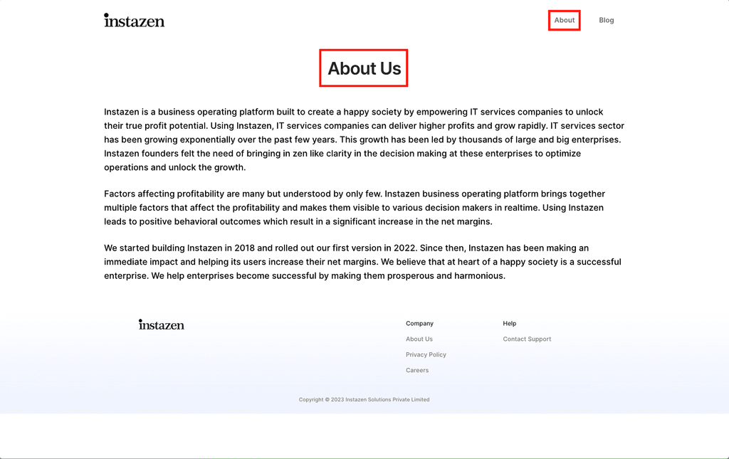
Inconsistent titles
Severity: 4The nav bar text and the page heading text is different. User might get confused on which page he/she is on and whether "About" and "About Us" mean the same thing.
Consistency and Standards
Missing Current State
Severity: 4The navigation bar does not show people where they currently are. There are no indicators which page user is currently on.
Visibility of System Status
Irrelevant Images used
Severity: 4The images used in these sections are unfamiliar to users. These images itself and texts associated with does not indicate what is being shown in these.
Match between system and the real world
Incorrect spacing
Severity: 4The blog is left aligned with negative space towards the right where as in rest of the pages the content is centre aligned. Also Logo has moved to different position compared to others sites.
Consistency and Standard
Repetitive content
Severity: 4The types icons used in these section are consistent, but the icons itself are repeated. The context or texts also feels repeated making these redundant violating "minimalist design" guideline.
Aesthetic and minimalist design
Inconsistent images
Severity: 4Blog images are not consistent. Images are being used in some places and in others illustrations are being used.
Match between system and the real world
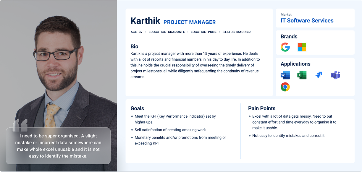
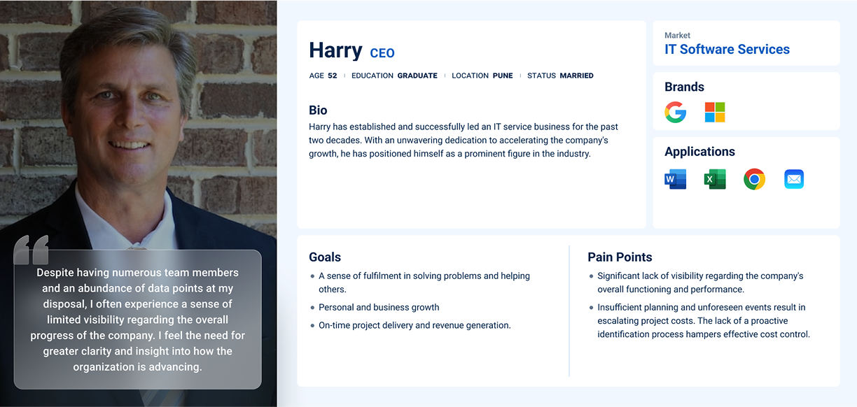
Proto-Persona
From the stakeholder interview, I gained insights into the business objectives, the product's value proposition, and some initial understanding of the target audience. Using this information, I've developed a proto-persona as displayed below.
User Interviews
While I initially created a proto-persona based on insights from stakeholder interviews, it became apparent that this approach was not sufficient due to the absence of user research conducted on the stakeholders' part. The inputs were reliant on assumptions and limited user interactions.
So I proceeded to conduct user interviews with the product's customers to gain a deeper understanding of their challenges and how the product addressed them.
The interviews provided the following insights:
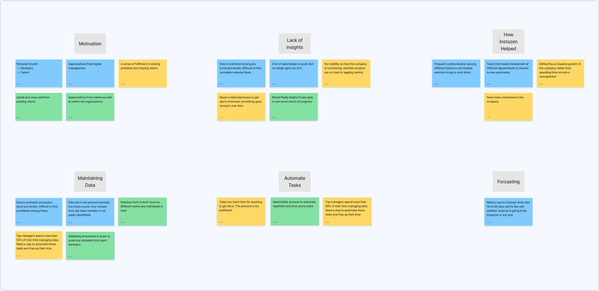
Managing Data
Participants find it tedious to maintain accurate data from different sources in excel. It becomes more difficult as team size grows.
Communication Gaps
Need for effective communication among teams, especially for project updates, addressing concerns and managing expectations.
Lack of Insight
Unpredictable factors during the project lifecycle can affect project costs, revenue, and overall organization performance.
Need for Prediction
Participants value the capability to predict future outcomes and challenges to strategically plan and organize work.
Centralised Platform
Clear need for a platform that streamlines data management and validation, reducing time and effort required.
Persona
Following the research phase, I organised the gathered information into personas, affinity maps, task flows, and sitemaps.
I developed a user persona that embodies the feedback and opinions shared by actual users of Instazen in my interviews and survey responses. Consistently referencing this persona throughout the design process ensured my solutions aligned with users' core needs and effectively addressed their issues.
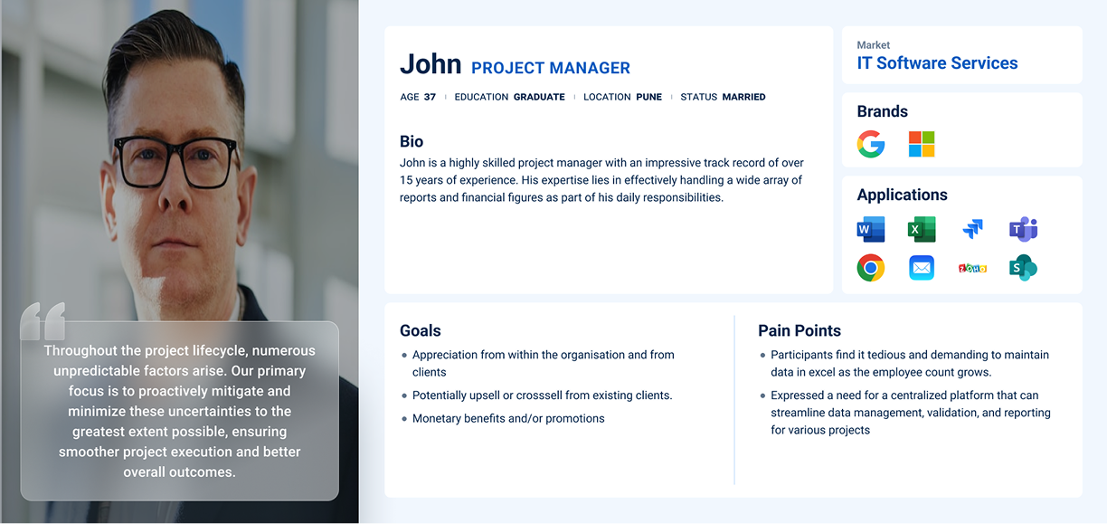
Secondly, the CEO, who gains a comprehensive overview of the organisation, providing the opportunity to strategise for optimization and revenue growth.
Affinity Map
After creating my persona, I created an empathy map based on patterns I uncovered from my user interviews. This helped me view things from their perspective and gain a deeper insight into what users may be looking for in the product.
Task Flows
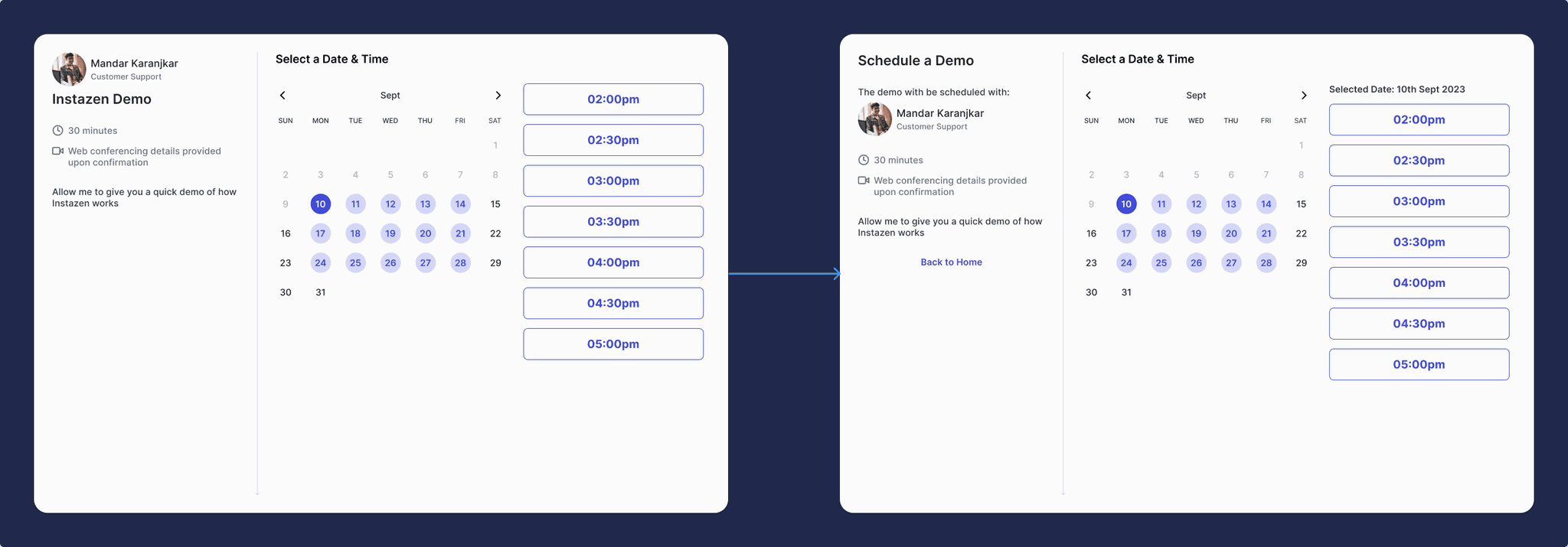
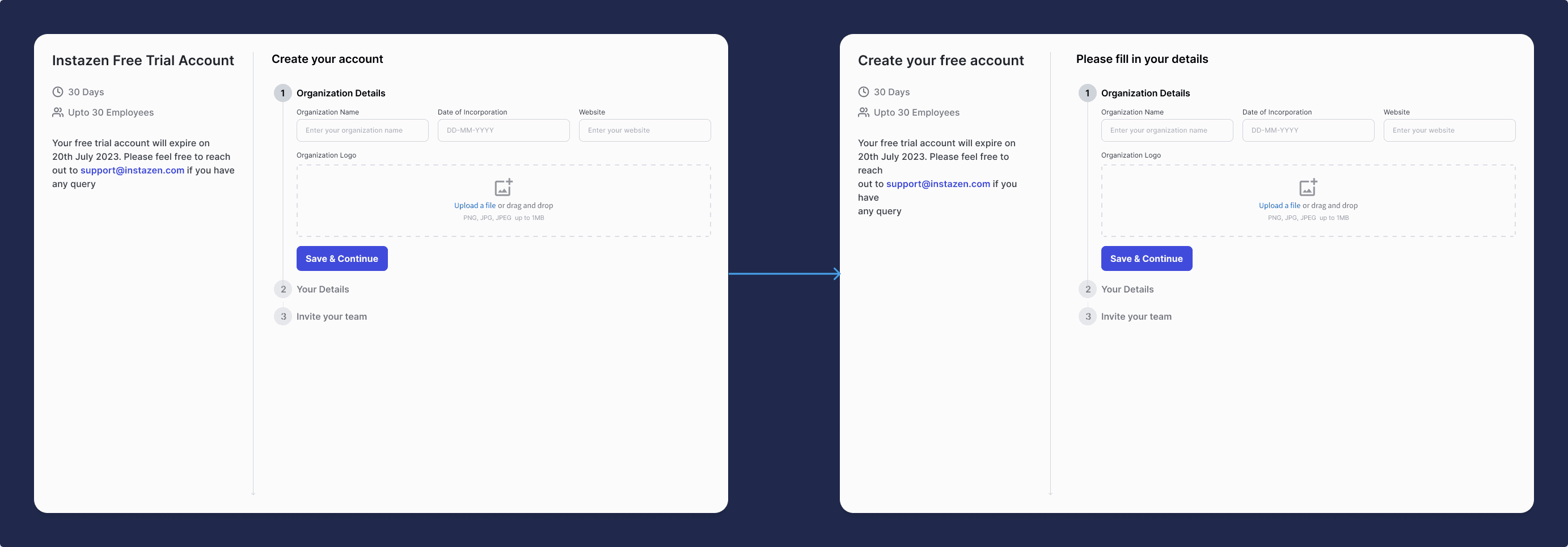
After creating personas, the next step was to define the tasks that users could perform after landing on the website. I came up with two task flows i.e. Schedule a Demo and Start Free Trial.
The introduction of the Start Free Trial flow in the new design is motivated by two primary reasons:
- It will allow potential customers to experience the product firsthand, enabling them to access product's value and suitability for their needs. This also reduces the risk and uncertainty associated with making a purchase, increasing likelihood of conversion.
- During recent client onboarding, it was observed that every company has it's own distinct characteristics and processes, necessitating multiple adjustments to cater to their specific needs. Introducing a free trial option facilitates an evaluation to identify any mismatches between the product and the client's process, enabling any proactive adjustments before committing to payment.
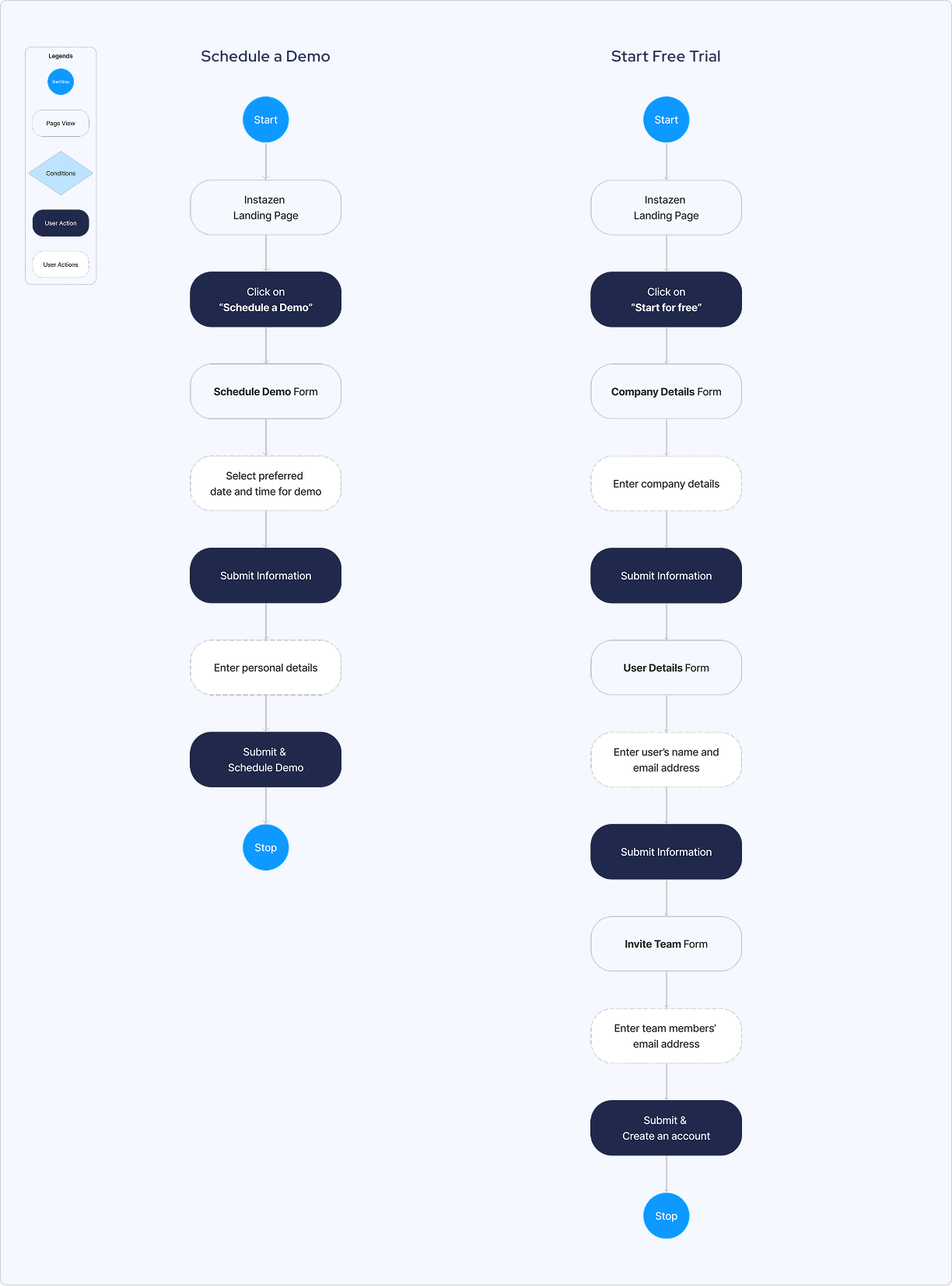
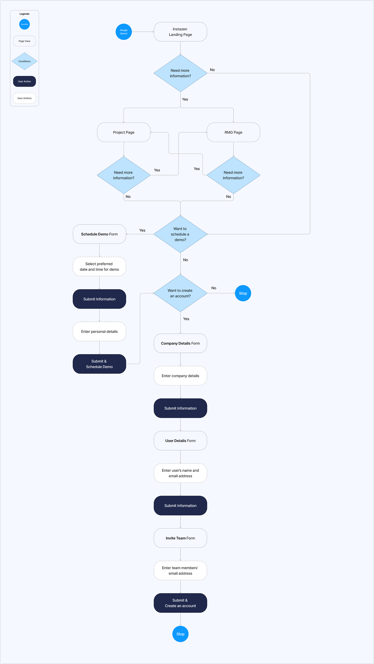
User Flow
User flows was then created to map out the various ways a user can go through to schedule demo and create an account. This includes the different actions and decision points that users may encounter that can impact their path to completion.
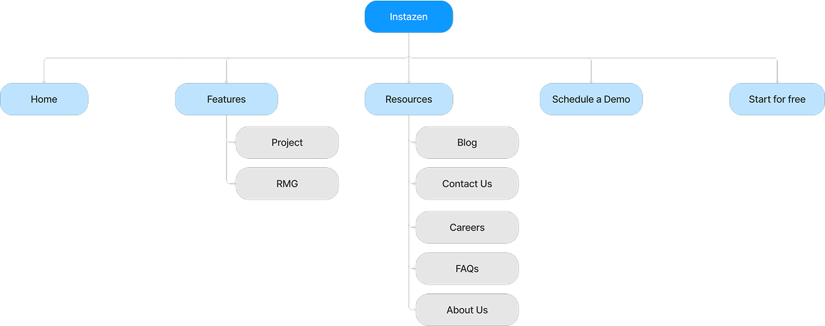
Sitemap
I mapped out the features that would be most important to the Instazen website and organized them in a way that would allow for easy navigation. This served as the blueprint of the website and helped me visualize the layout and hierarchy of the content.
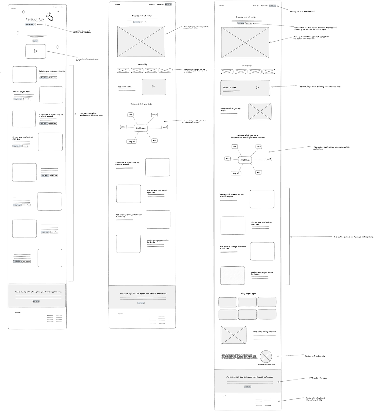
Sketching Solutions
After completing the research and define phases, I initiated the development of visual solutions following the branding guidelines.
Once I had visualised my user flow and defined the key pages, I began sketching potential layouts and explored different directions for the design.
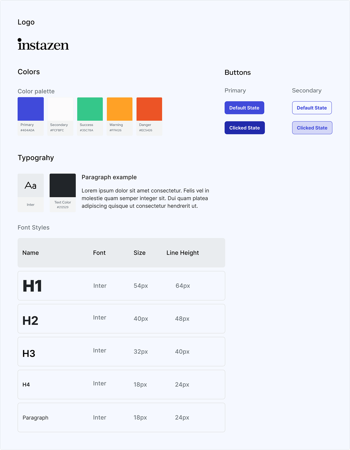
Branding
I followed the branding from old website as instructed by the stakeholders. It is as follows:
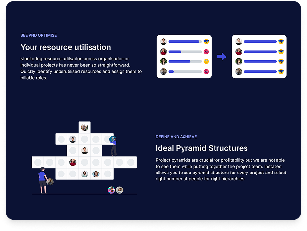
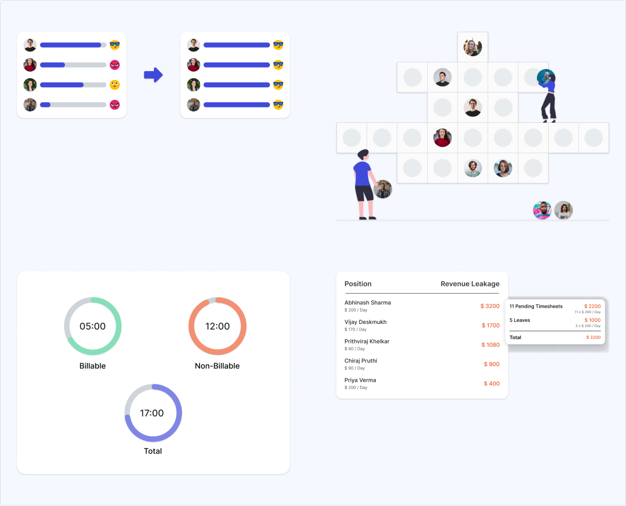
Feature Images
During the design process, there was a need for images that not only align with the branding but also effectively illustrate the features. As these images were not available from the stakeholders, I took the initiative to create them.
High Fidelity Mocks
After establishing my UI design, I polished my wireframes and applied the established styles to the screens. Bringing it all together to create something inclusive and human-centric.
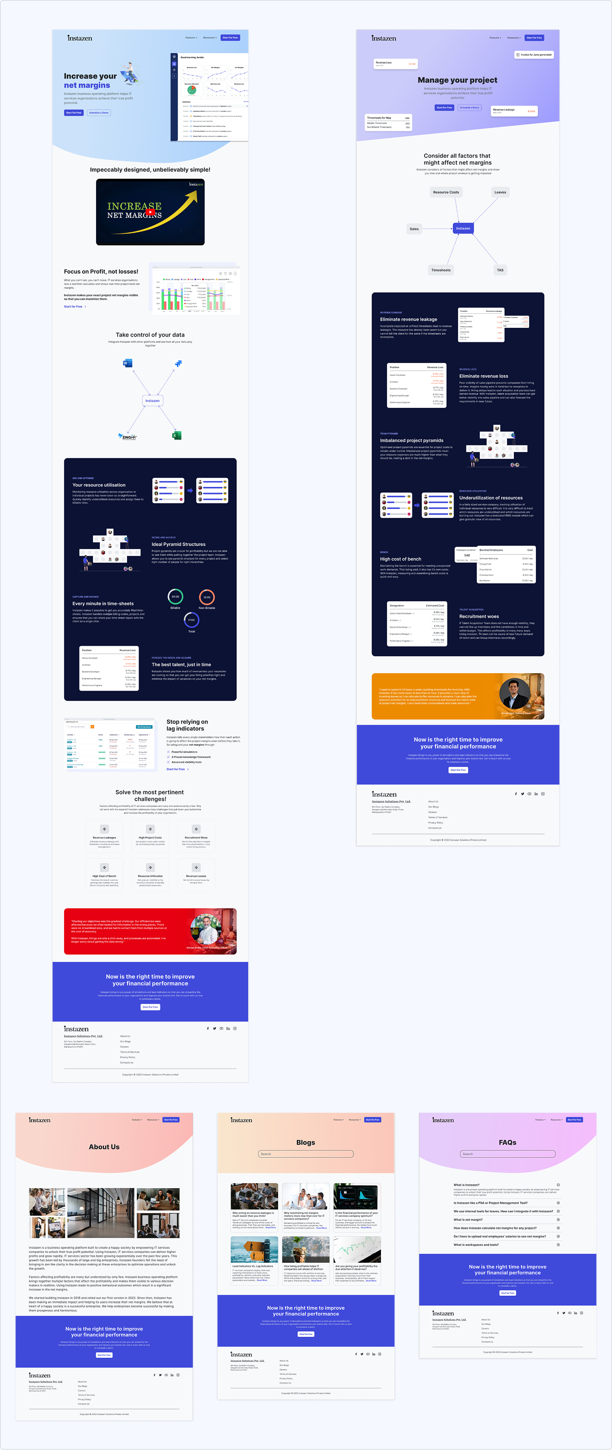
High fidelity mocks for mobile:
Usability Testing
I conducted a usability test with 5 participants who fit my target audience over 2 days, moderated remotely. Users were asked to explore the website and complete tasks while narrating their thoughts and initial impressions.
Test Objectives
- Test overall flow and navigation of the redesign website
- Check for any confusions while going through the website
- Check if users can complete key task flows without hiccups
- Validate if users understand the problem Instazen solves
Test Results
- All users understood the website purpose with no navigation issues
- 60 % of participants completed task flows without difficulty
- Various pain points discovered during tests
Design Iterations
Priority revisions were made based on my usability test feedback. The changes implemented are as follows:
Fix typographical hierarchy
Some participants were confused about user avatar and title in the top-left section. So I have changed the hierarchy and added more information to bring more clarity.
Improve consistency
CTA button text in home and title of this page does not match. It is creating initial confusion about what this page do. So I have made changes to keep them consistent.
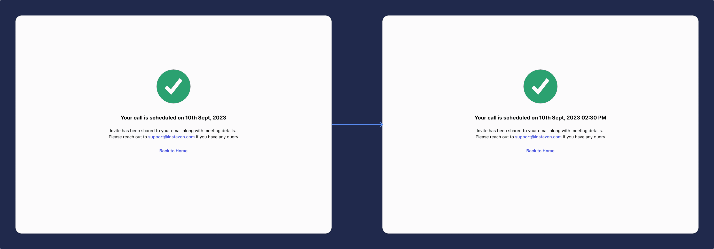
Bring more clarity
Some participants complained about missing demo time. So I have added it the title beside the date.
Reflection
This project provided me with a profound understanding of design within an enterprise framework. Collaborating with stakeholders, clients, and product managers to refine the final design within certain constraints was both fulfilling and enlightening.
Key Learnings
- Balancing creativity and practicality to achieve design excellence
- Working within brand constraints while improving user experience
- Importance of stakeholder alignment in client projects